The Signs of Creemore
For more than three decades, the village and I have spoken through signs — A quiet dialogue of craft, design, and place.
Each piece is clean and simple, rich in story — respecting its building and the business’s brand while contributing to the overall harmony of the streetscape. Guided by the village’s layered character and history, these signs quietly reinforce Creemore’s “brand without a brand,” attracting visitors for its charm, character, and authenticity.
Each piece is hand-crafted using premium waterproof materials, stainless steel, and 24 kt gold leaf.
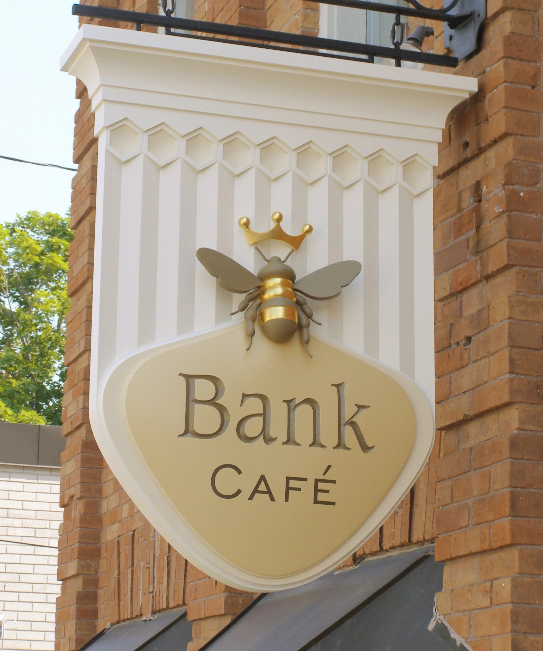
The bee symbolizes community and wellbeing, echoing Creemore’s early settlers who kept bee colonies. The sign is carefully proportioned to the storefront, interior, and architectural details. (Select for more details)

A 5 ft × 4 ft handcrafted and gilded hanging sign, its form drawn from historic apothecary show globes—once suspended as quiet beacons of health and care, guiding people toward wellbeing.

Where the Mad & Noisy rivers meet, their energy mirrors the collective of artists within. Flowing bands of colour wrap the sign, weaving individual voices into a single, continuous current.
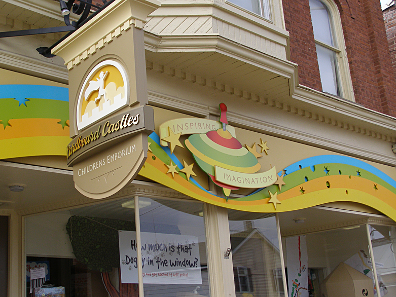
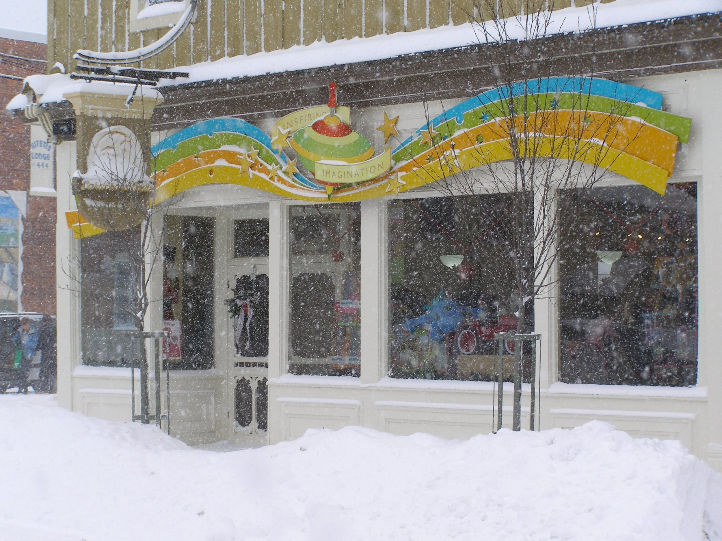
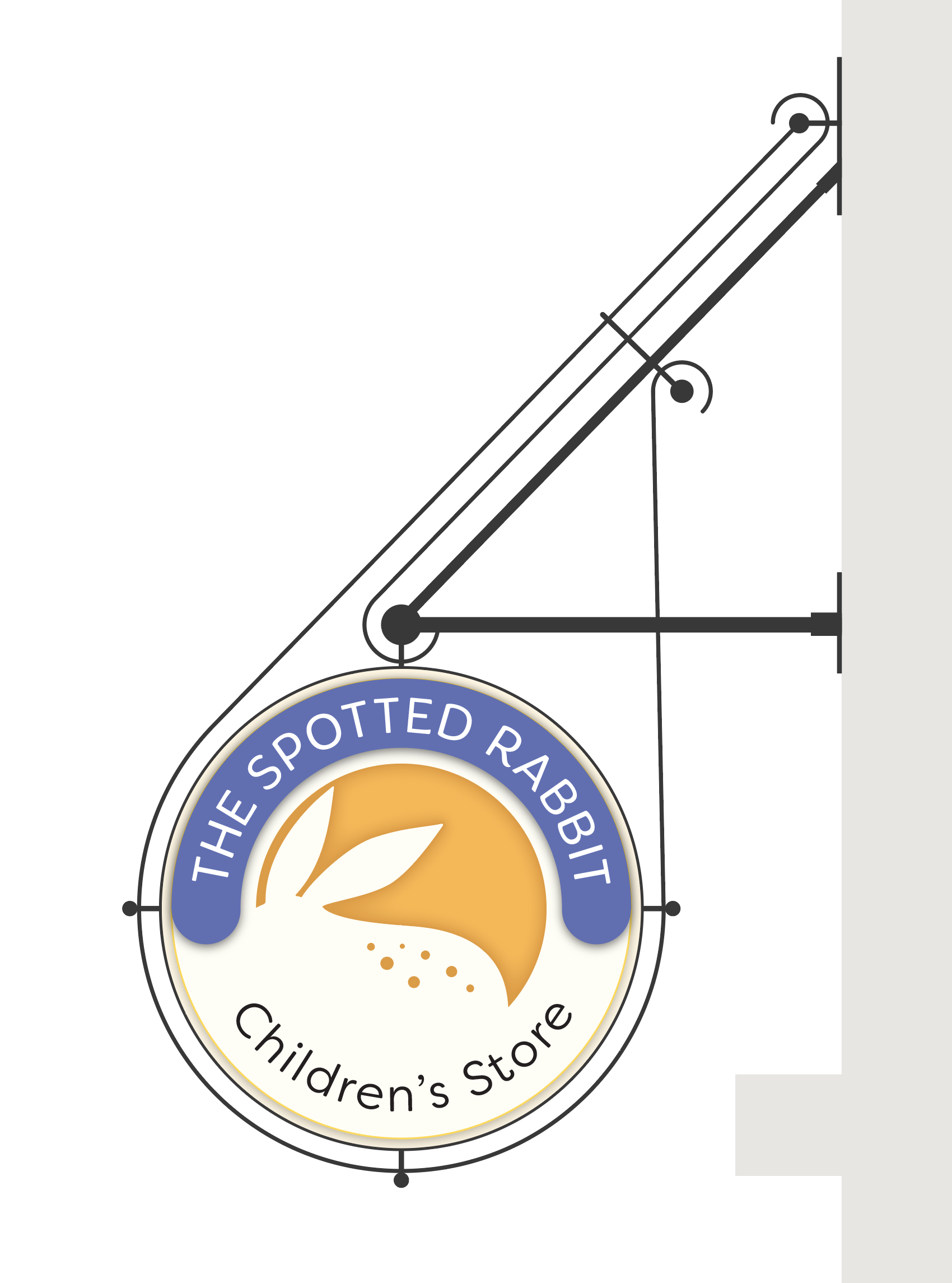
A toy store that became a destination for those seeking quality, heirloom toys. The spinning top and vintage palette were designed to appeal to the child in all of us—especially those wishing to pass on the nostalgia of their own childhood to the next generation.

Clean and simple, rich in story — each sign respects its building and business’s brand while contributing to the overall harmony of the streetscape.

A logo created for a toy store that celebrates inspired play, sparking imagination and curiosity. Minimalist and understated, it invites the viewer to fill in the blanks—simple and engaging, just like the toys it represents.
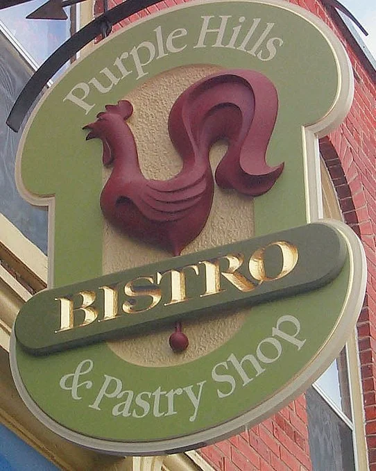
Signage and branding for a French bistro and pastry shop. The rooster symbolizes the French heritage, while the mirrored top and bottom shapes of the sign echo the curves of rising pastries.
A sign designed as a dynamic part of the streetscape, capturing the attention of visitors at a glance. Its metalwork supports the piece with quiet assurance, adding a subtle playfulness to the display.
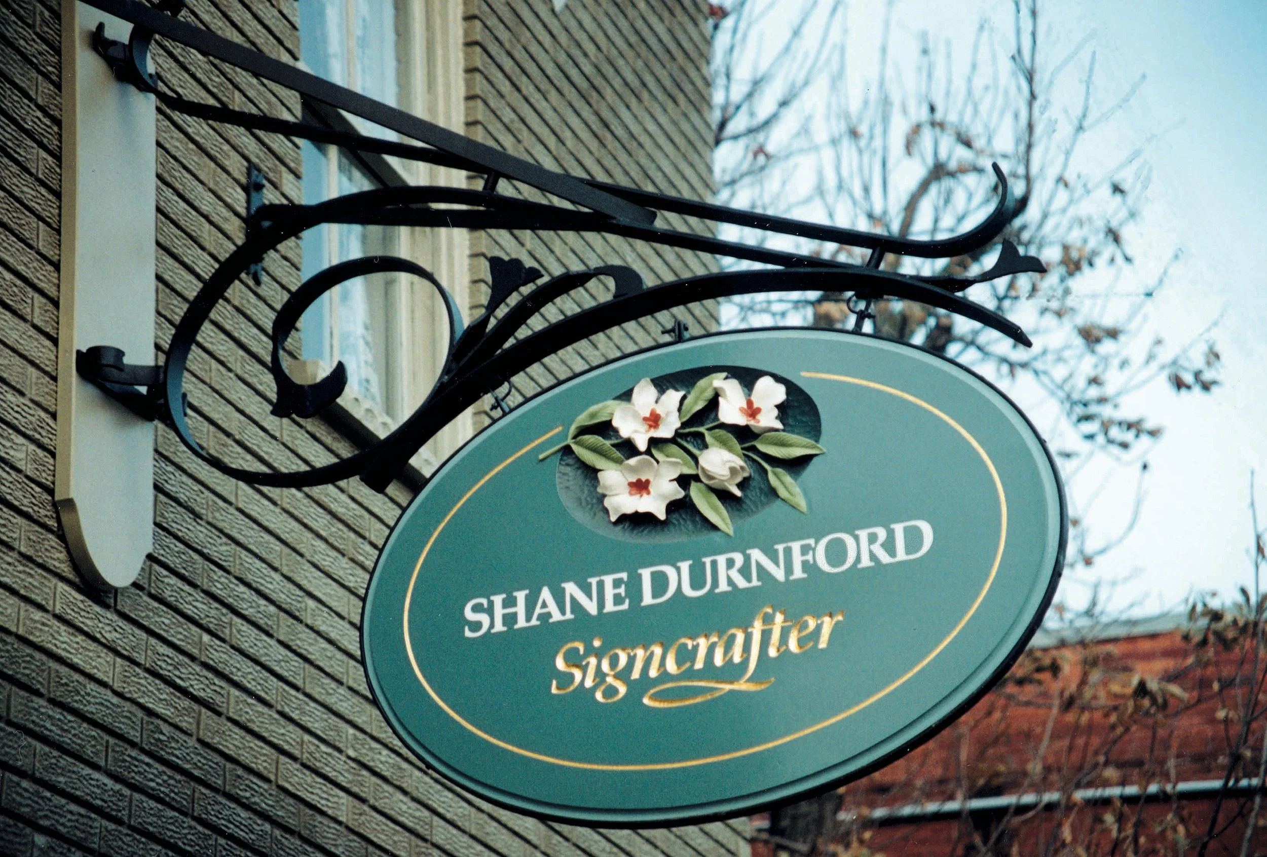
Signage for my Mill Street studio, inspired by the romance of Art Nouveau. The design celebrates beauty, timeless craftsmanship, and a devotion to a time-honoured artistic tradition.
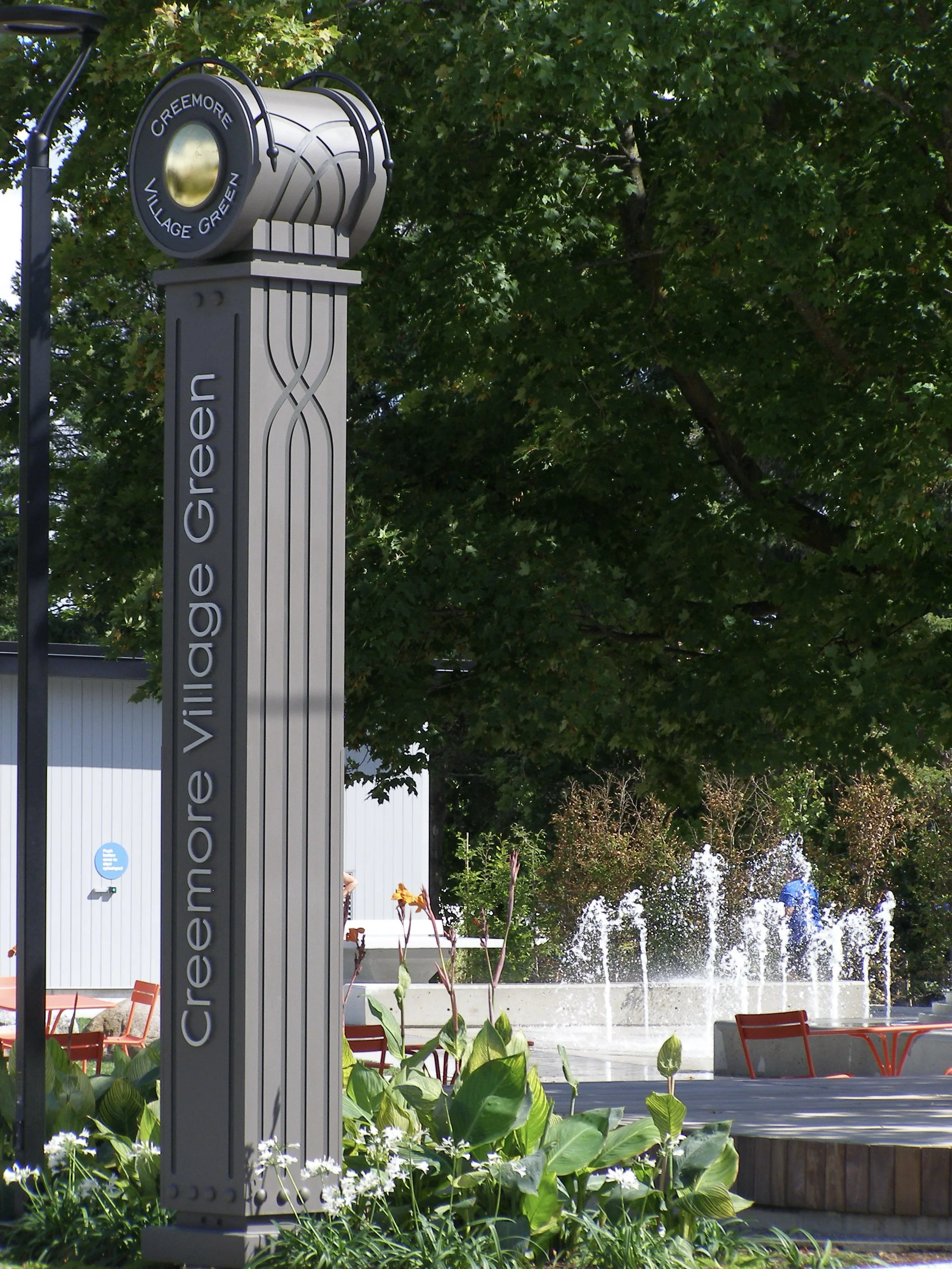
A 16 ft entrance marker for the community park on the green, standing as a beacon inspired by the village’s railroad heritage. Its design blends industrial Art Deco train symbolism with the clean, organic, minimalist qualities of the park. (view the project)
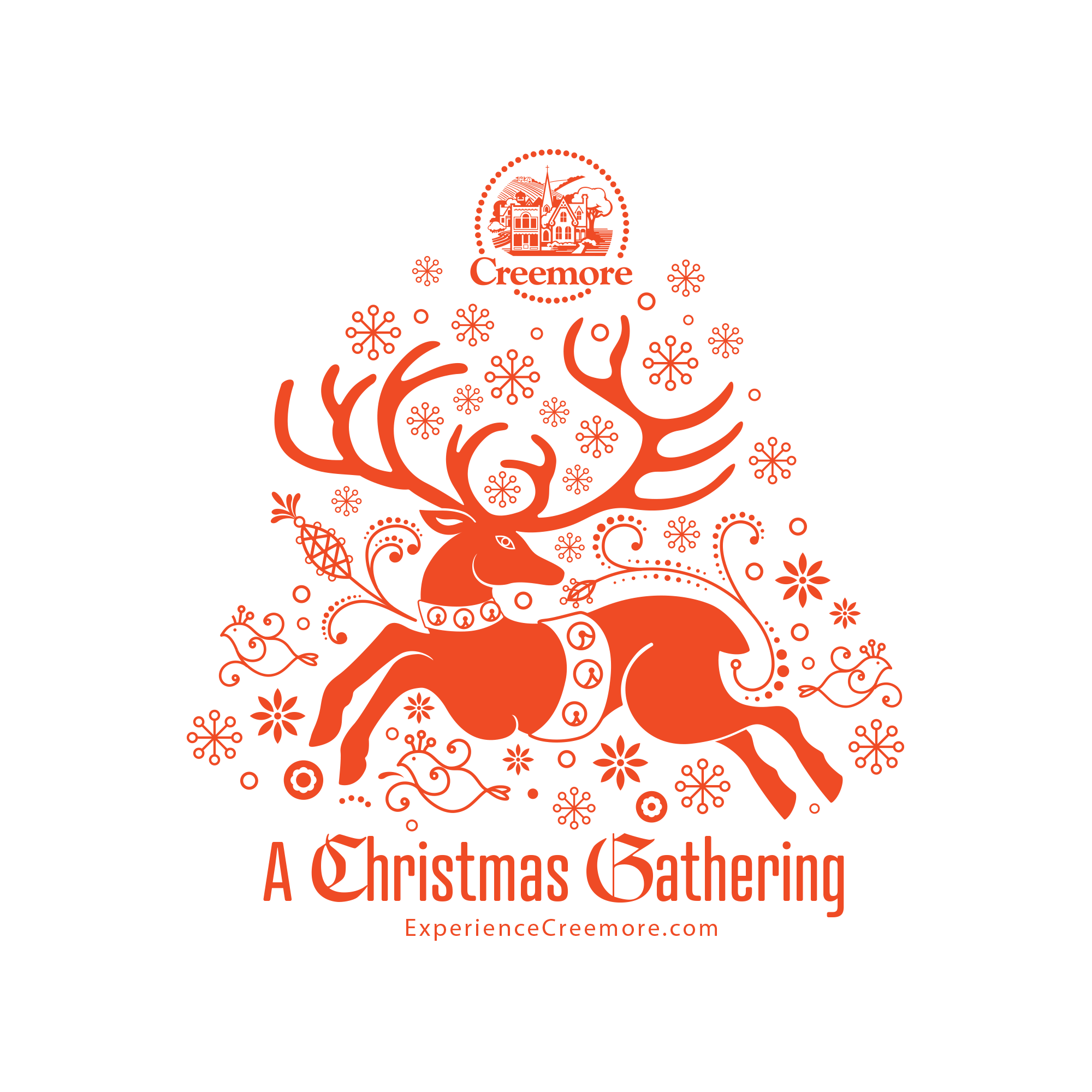
Visual branding for Creemore’s Christmas celebration, inspired by traditional European Nordic folk art. The design evokes old-world holiday charm, capturing warmth and authenticity without the fluff or commercialization.
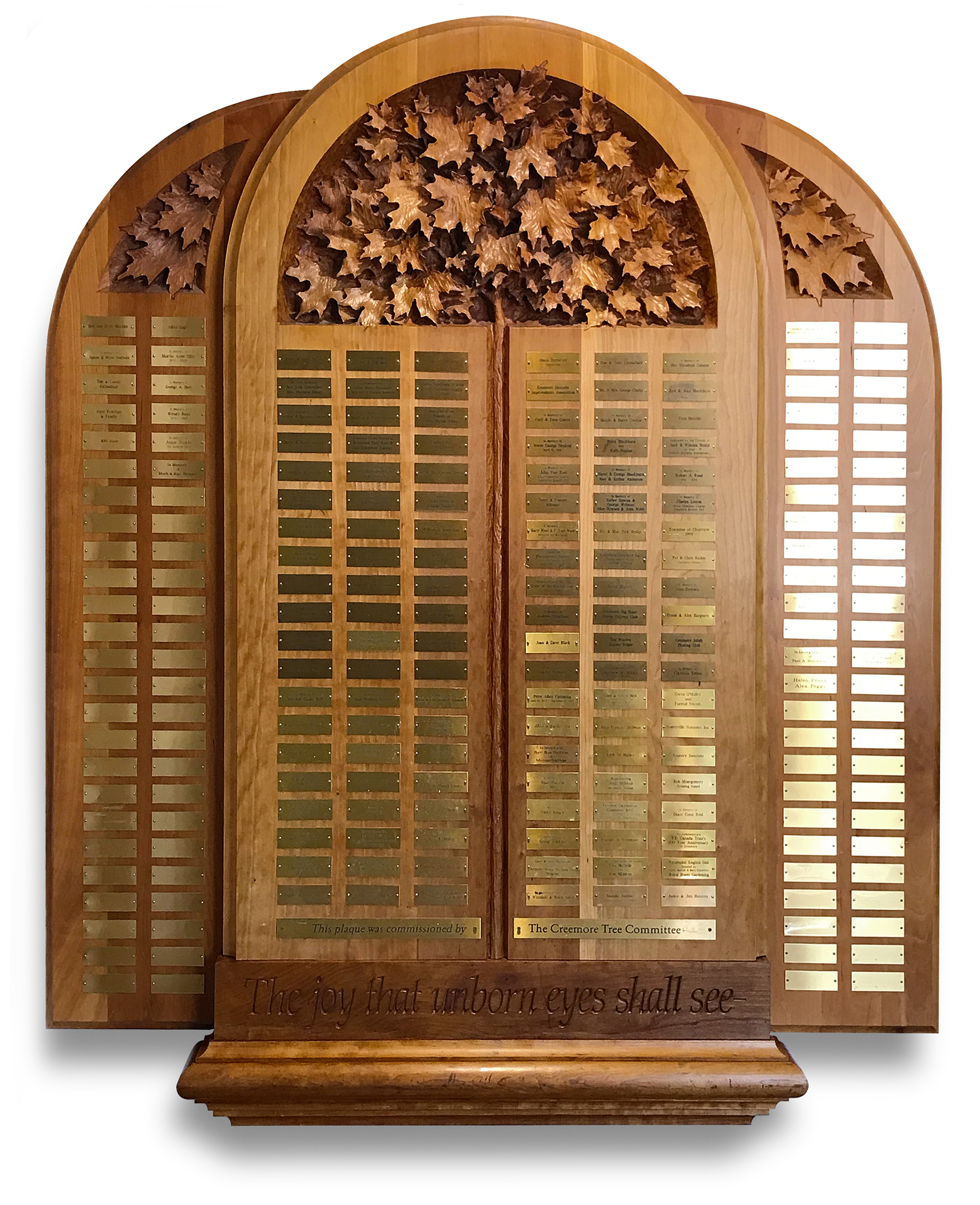
Hand-carved 72" x 60" x 3" cherry wood plaque recognizing donors to Creemore’s tree program, honouring contributions for future generations. Installed at the Station on the Green, it celebrates community and enduring legacy.

Way finding signage designed to complement the entrance marker, maintaining the same heritage-inspired, clean, and minimalist aesthetic throughout the park.

Hand-carved and hand-lettered gilded sign, hung on a hand-wrought iron bracket, celebrating the Hungarian heritage of the restaurant. The floral pattern on the sign echoes the embroidery on the staff’s serving aprons, weaving tradition and craft into the visual identity.

Hand-lettered brand identity for a vintage, European-inspired tradition of cycling and food, celebrated across the rolling hills of the Creemore countryside

La Cuisine du Soleil — A bistro celebrating the flavors of Provence. The sun evokes the “cuisine of the sun,” while the shield-shaped sign reflects Provence’s Roman heritage.

An illustration capturing the quality and romance of Creemore’s Turas Mor, bringing the spirit of the experience to life through visual storytelling.

Visual branding for Creemore’s iconic Copper Kettle Festival, celebrating the community, craft, and charm that make the event a beloved local tradition
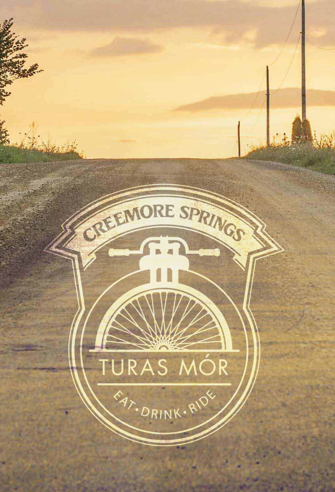
Patch and badge design for Turas Mor, celebrating the uniqueness and heritage of this time-honoured event.

Hand-lettered and integrated into the side façade, the Bank Café’s branding blends seamlessly with the building, lending an iconic presence to the streetscape while fading gracefully into the architecture.

A traditional design with a quiet, symbolic, and unique sign hanger, conveying a sense of permanence and an established, timeless quality.
Branding and sign design for a smoothie bar specializing in high-energy protein drinks, catering to the many cyclists passing through Creemore. The sign’s vintage design, featuring a sprocket motif, reflects the village’s heritage while directly connecting to the café’s active, cycling-focused audience.
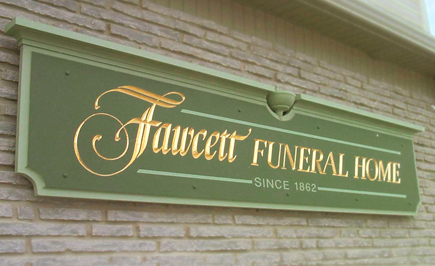
A funeral sign designed in traditional lettering and format, authentic to the mid-1800s when the funeral home was established.

Logo for a restaurant specializing in hearty, traditional North American cuisine, reflecting the warmth, simplicity, and comfort of classic dishes.
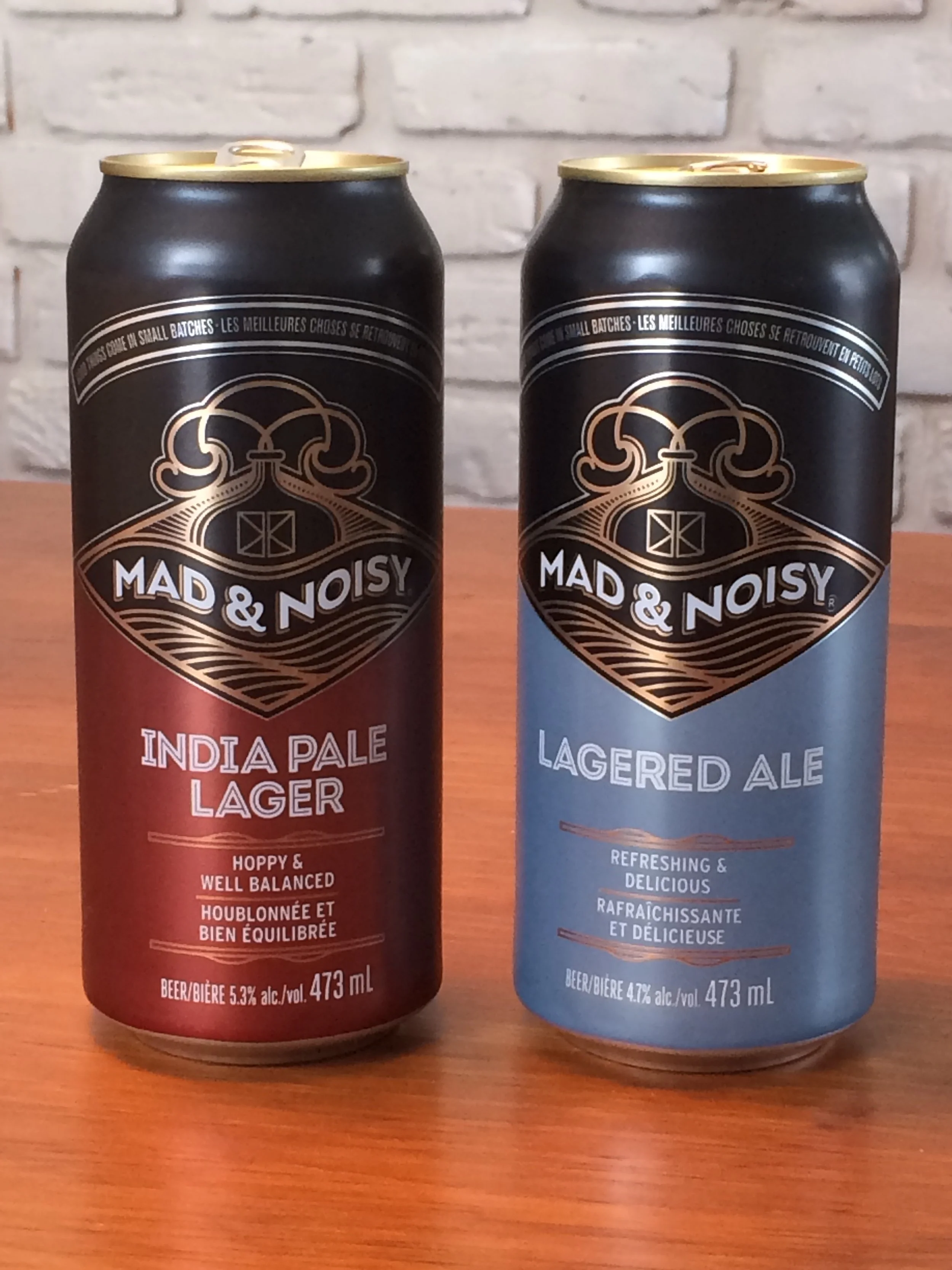
Collaborative packaging design for Creemore Springs’ “Mad & Noisy” brand

Clean and fresh packaging design for Miller’s Dairy, emphasizing simplicity, quality, and the purity of the product.

Café sign designed in the style of a 1930s classic diner, reflecting the character of the menu and interior.
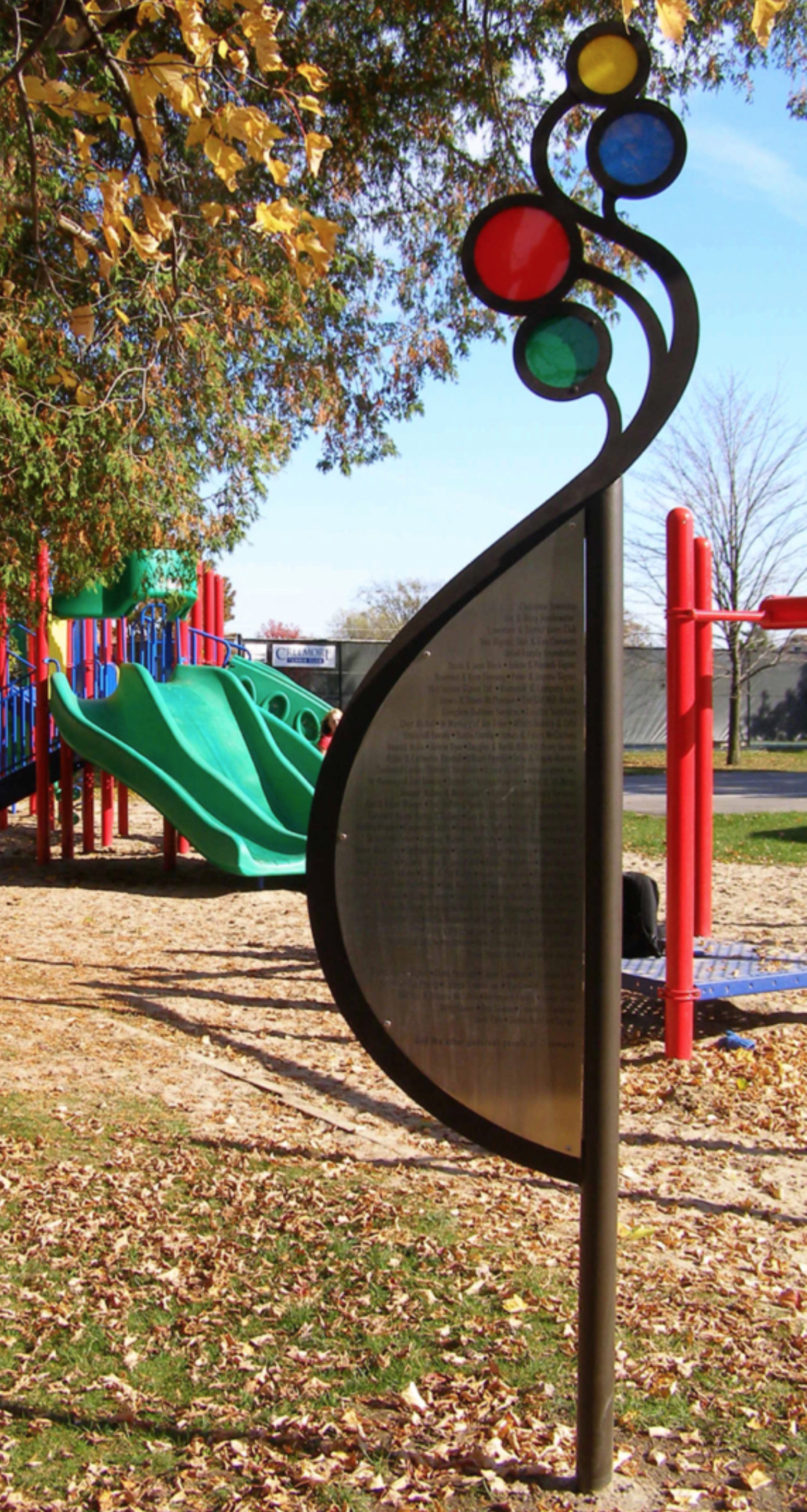
Donor plaque honouring contributors to a children’s playground. The design reflects the shapes and colours of the equipment while evoking the curve of an expectant mother and the playful movement of released balloons. Crafted in laser-etched stainless steel, iron, and acrylic.
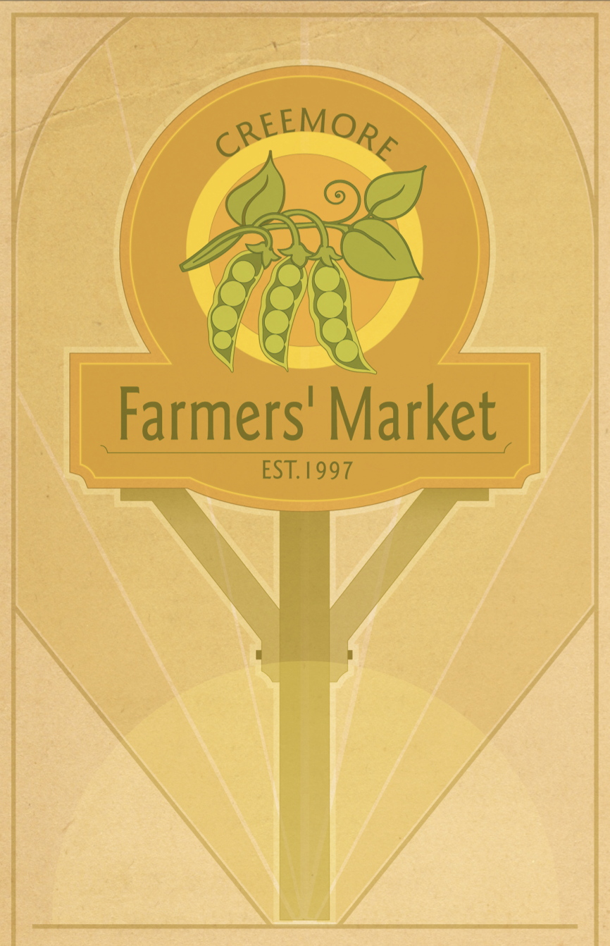
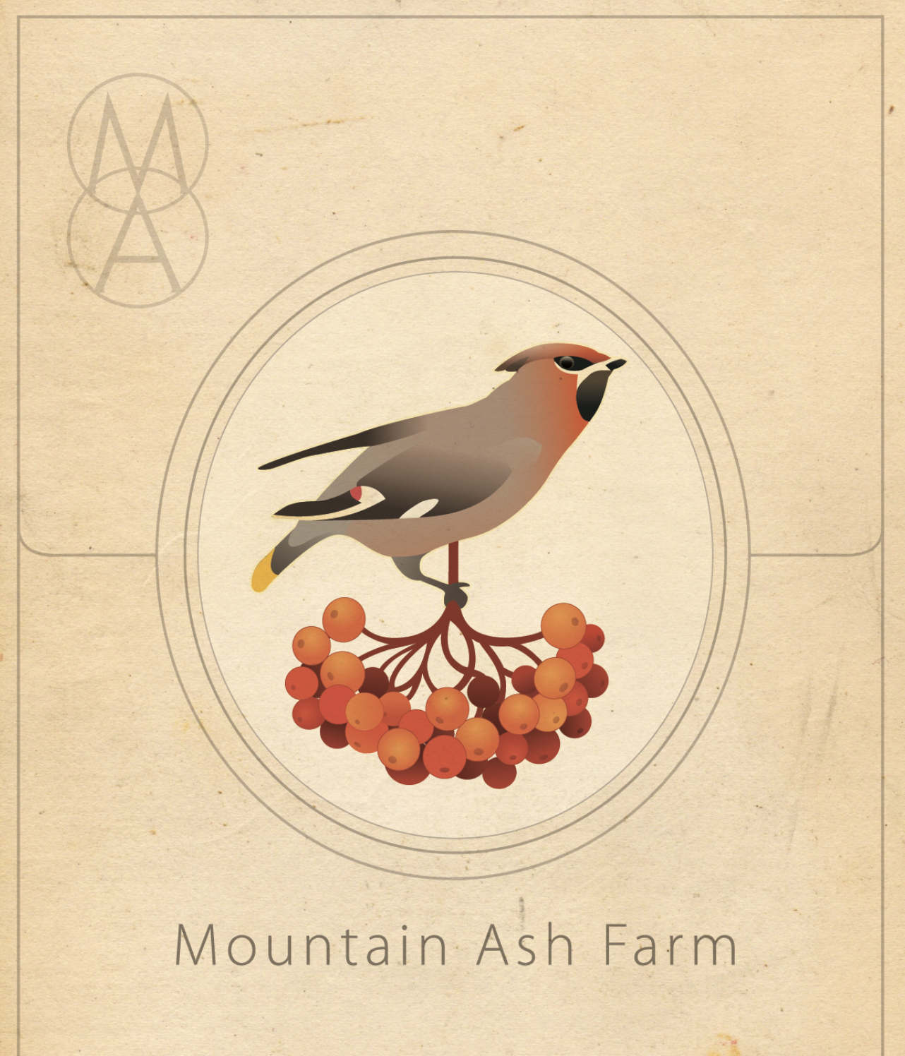
Signage and branding celebrating Creemore’s agricultural heritage.
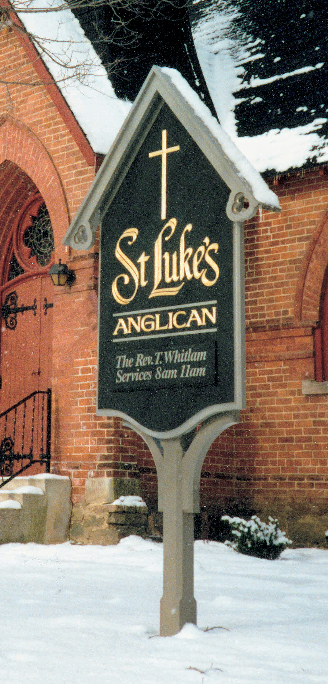
Sign designed in the vernacular of the period in which the church was founded, with a form proportioned to echo the roofline and Gothic Revival architecture of the building.
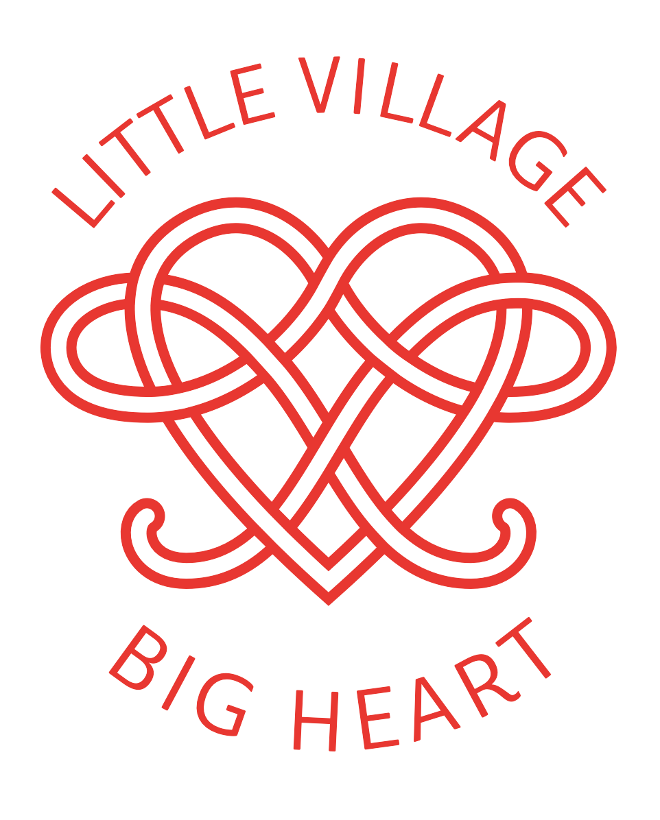
Creemore—Gaelic for “big heart.” This logo appears throughout the village, reflecting its Irish heritage and the enduring spirit of the community since its founding.
Visual brand identity for a local inn, featuring a classic motif that evokes the romance of the surrounding landscape and celebrates its historic farm heritage.
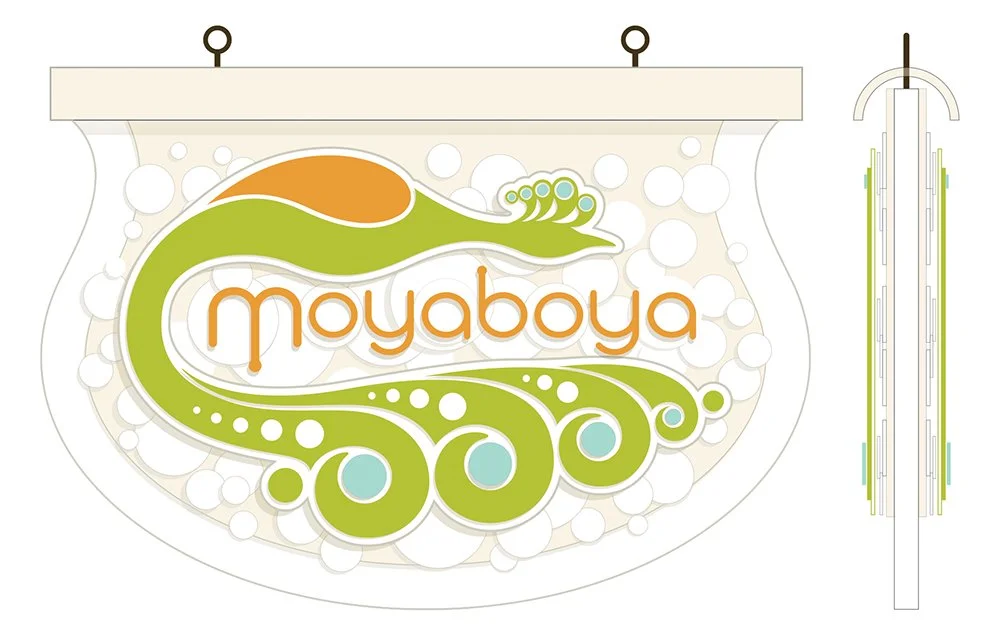
Moyaboya—Croatian for “colour.” Inspired by the store’s mid-century chandelier, the sign blends tradition, heritage, and contemporary design to reflect its playful, vibrant character.

A façade-spanning sign with semi-translucent glass and dimensional carving, held by a hand-forged Industrial Deco iron hanger, creating a striking street presence.
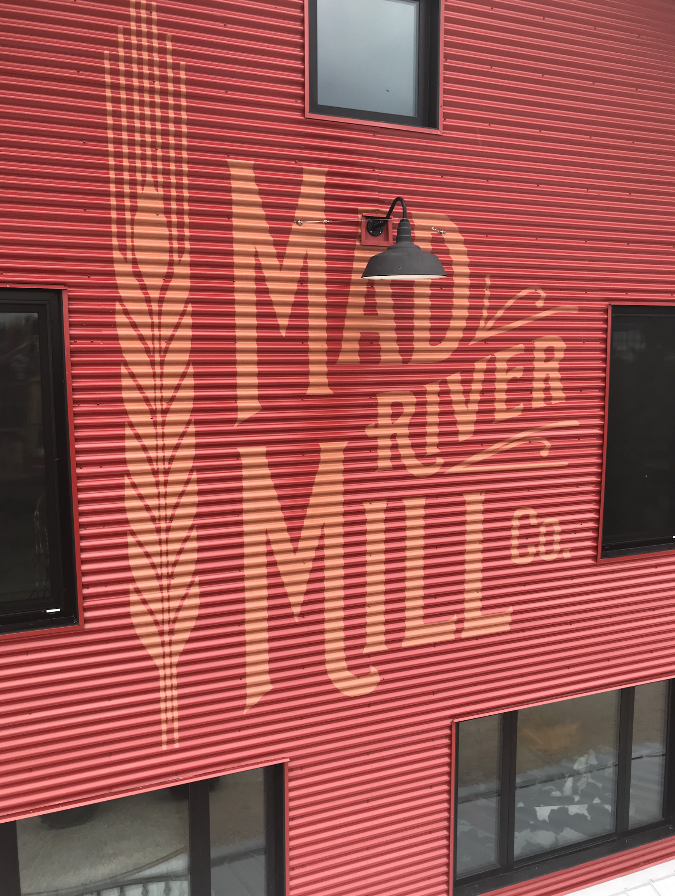
Hand-lettered on corrugated metal, with paint blended with 60% of the background colour to make the lettering appear embedded in the building, evoking an understated sense of history, time, and presence.
Consultations available for place‑based branding, signage systems, and streetscape guidelines.