
Shane Durnford Studio
Place Identity & Environmental Design
A Practice of Jayce Fox

already carries an identity
Whether it's a village main street, a family farm, a business, or a community, the strongest identities are discovered rather than invented.
For more than thirty years I've helped uncover the character of places and distill it into thoughtful expressions of identity. From visual identities and environmental graphics to commissioned entrance pieces, each project begins by observing what is already there rather than imagining what could be.
Every place
Stories of Place
Designing identities that belong.
Each project begins with observation and listening—to the land, the architecture, and the people behind the story.
o1
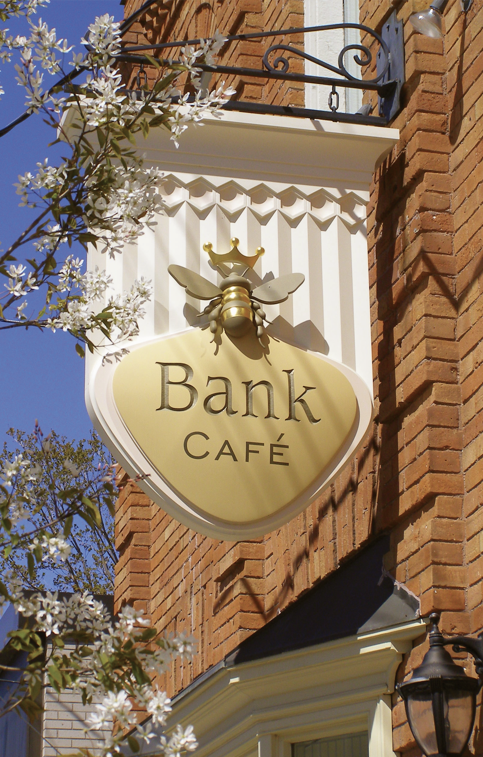
Bank Café
An Identity that feels as it has always belonged
Rather than simply designing a sign, the goal was to create an identity rooted in the building’s architecture and the history and character of the village. Every detail was designed to feel inevitable, as though it had quietly belonged there for generations
o2
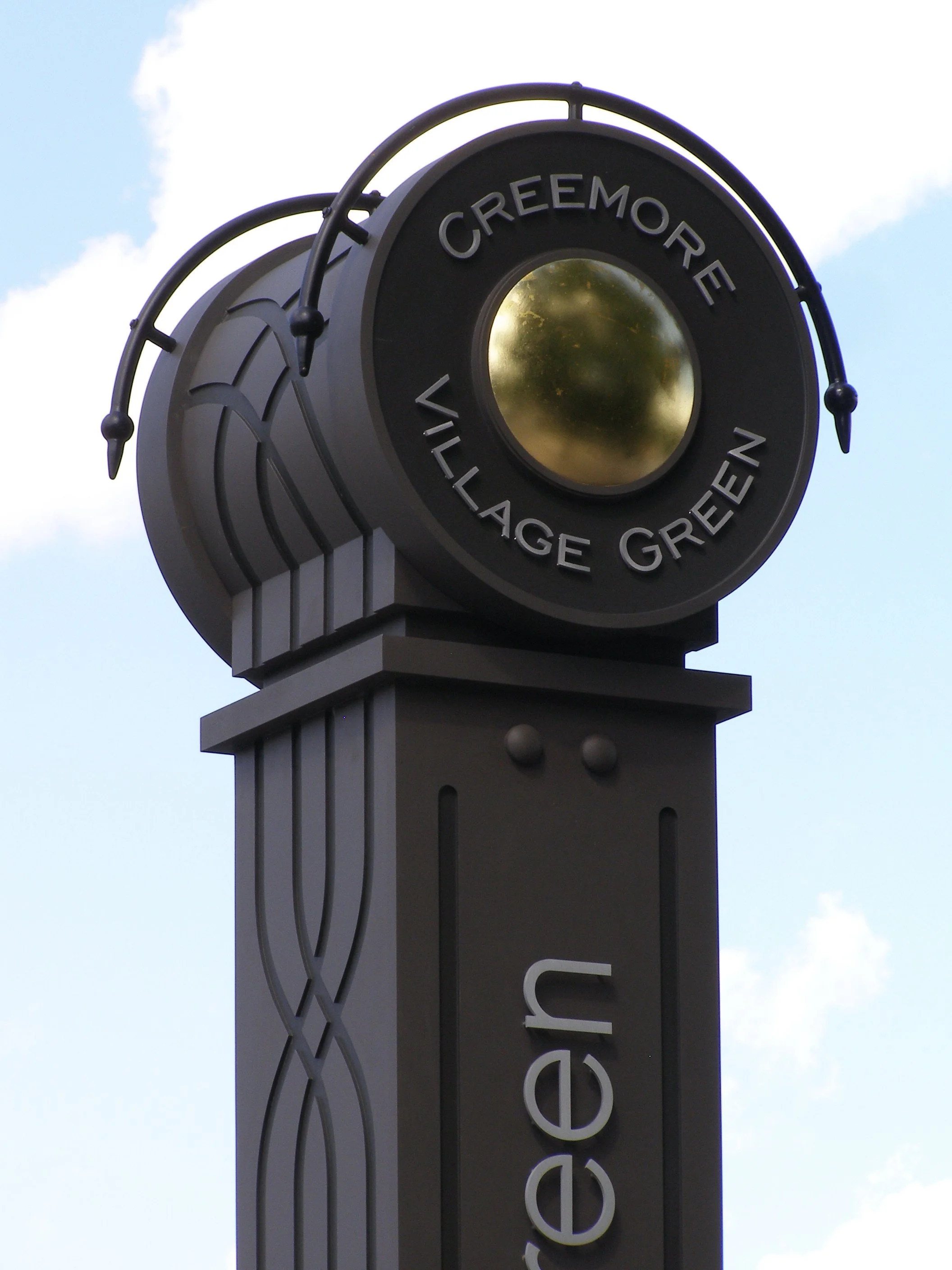
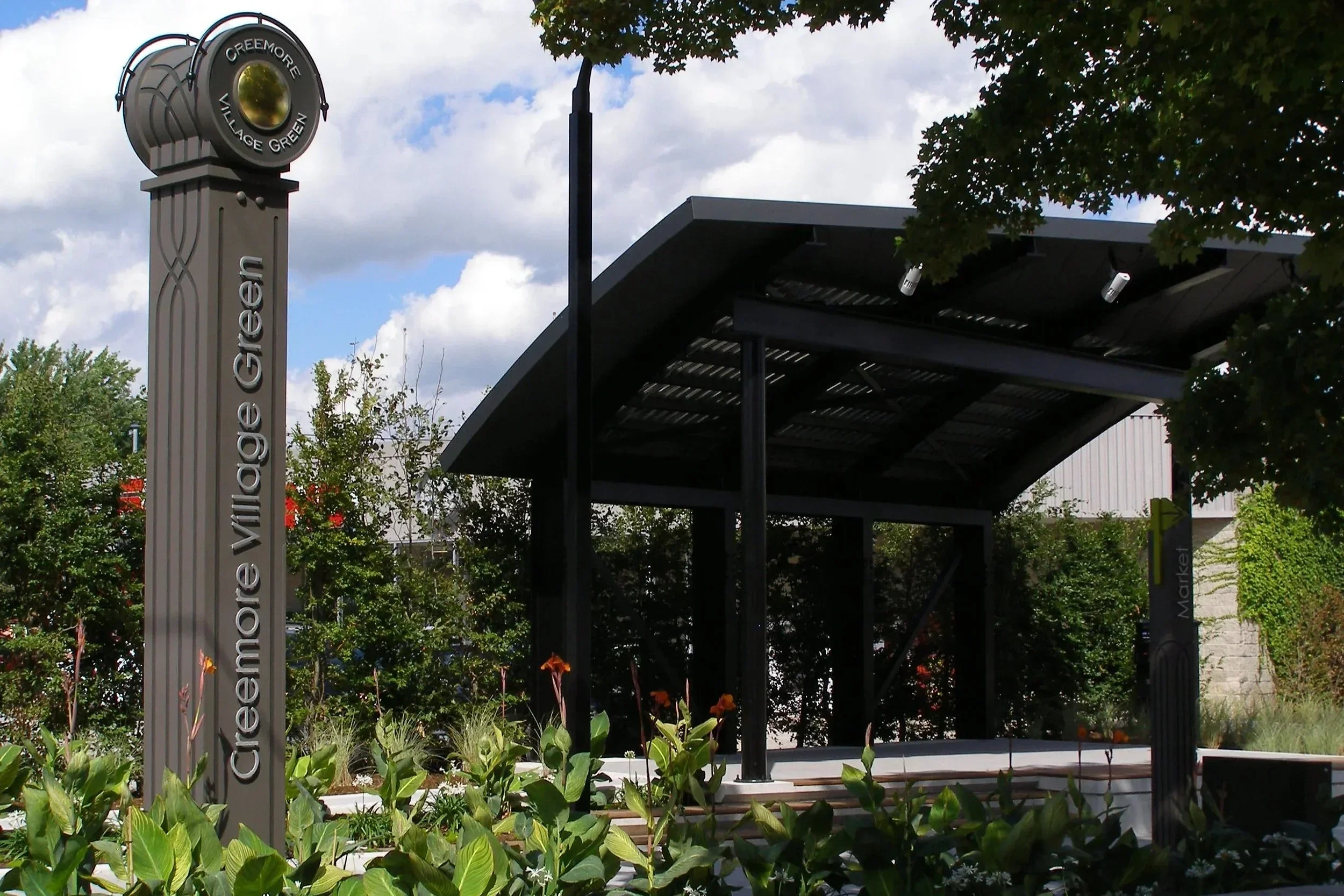
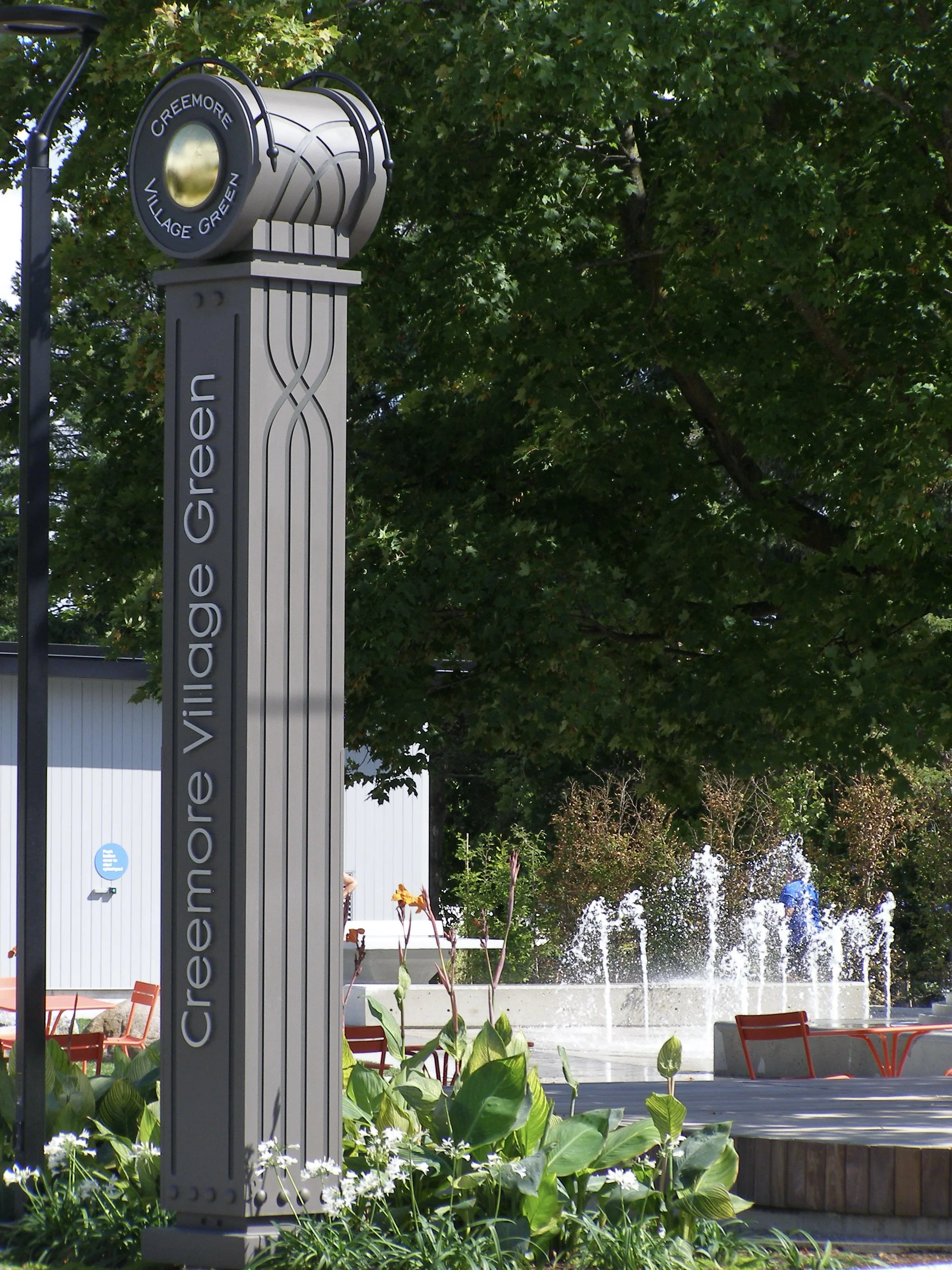
Creemore Village Green
A landmark that gives a community a center.
More than wayfinding,this project creates a recognizable landmark that strengthens the identity of the village and contributes to the everyday experience of those who gather there.

o3
Mad & Noisy Gallery
Where two rivers become one.
Inspired by the confluence of two rivers at the edge of the village, layered bands flow like the current- from the light of the surface to the earthy depths below. The fish is formed by the river’s flow, expressing the belief that art and life are inseparable.
View Project »
o4
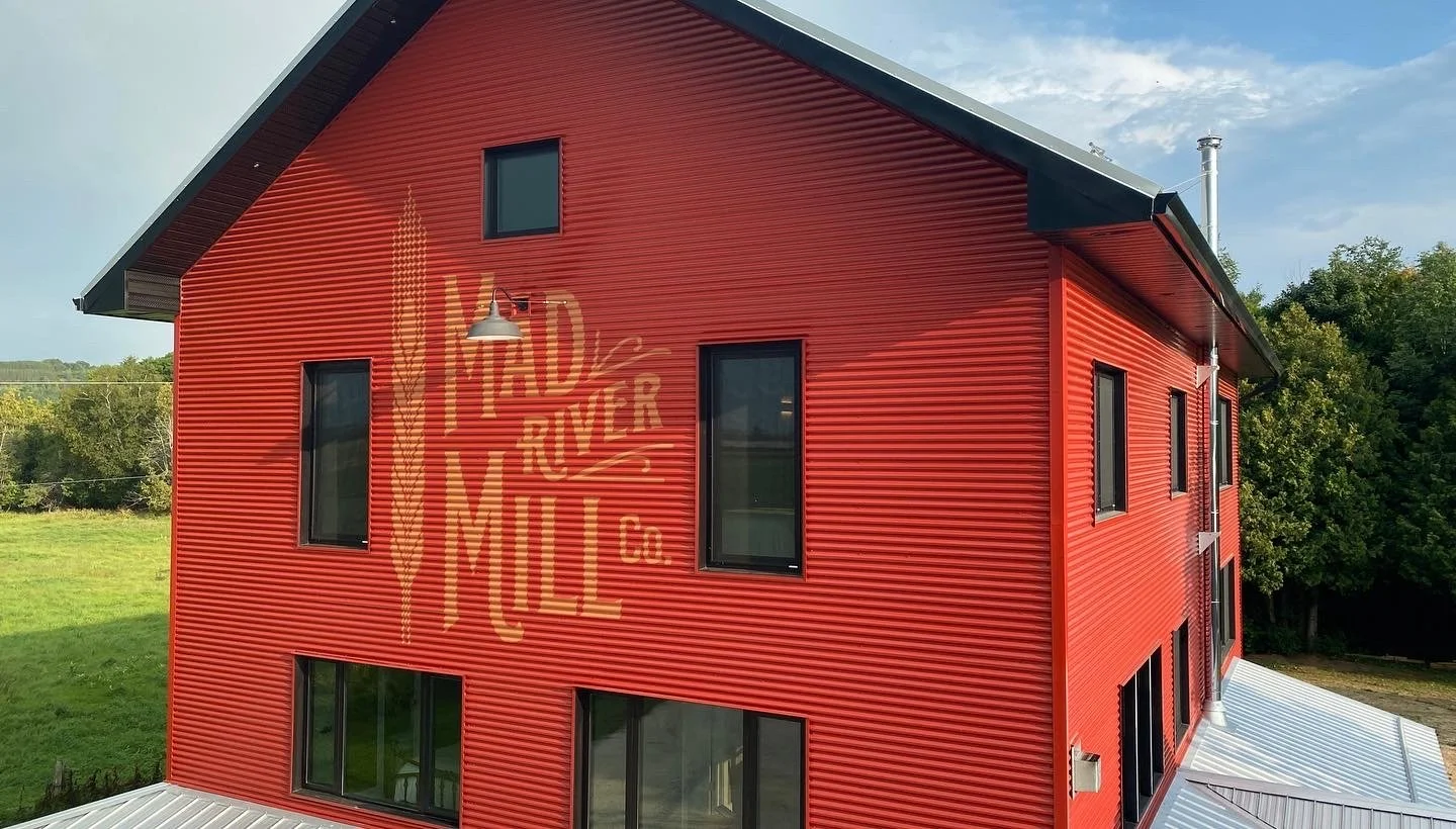
Mad River Mill
An identity shaped by place.
Inspired by the language of Ontario farm buildings, the renovated structure became the canvas for a hand-lettered identity that feels woven into the architecture itself. More than signage, it creates a quiet sense of belonging between the building, the landscape, and the history of the place.

o5
Chez Michel
Hospitality expressed before the door is opened.
Inspired by Provence, the identity combines the region's Roman heritage with the warmth of la cuisine du soleil. The result is a welcome that begins long before guests take their first seat.
Explore the Archive »
Identity discovered through place
A meaningful identity does more than make something recognizable. It creates a feeling of belonging.
Each project begins by looking closely—at the history, architecture, landscape, people, and stories that give a place its character. From that understanding, a visual language begins to emerge.
The result may take the form of a symbol, a sign, a gateway, a streetscape element, or an integrated family of pieces. Whatever its form, the work is designed to feel inevitable: distinctive, enduring, and deeply at home in its surroundings.
Areas of Practice
Place Identity

Visual identities for villages, destinations, neighbourhoods, organizations, and properties—developed from the character of the place rather than imposed upon it.
Signs & Placemarkers
A limited number of distinctive signs, gateways, entrance pieces, donor installations, and environmental graphics conceived as lasting elements within their surroundings.


Logos, symbols, lettering, colour, and visual systems that express the essential character of a business, organization, or place with clarity and restraint.
Identity Design

Design Consultation
Creative direction and consultation for municipalities, business owners, architects, fabricators, and sign studios seeking greater visual cohesion, distinction, and connection to place.
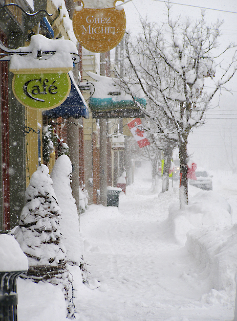
SIGNS OF CREEMORE
For more than two decades, the village of Creemore and I spoke through signs—a slow, lasting conversation between design, architecture, commerce, and place.
Created individually for local businesses and institutions, the signs gradually became part of a larger visual landscape. Together, they helped express the particular character of the village without reducing it to a formula.
A Village Marked by Craft
A Considered Practice
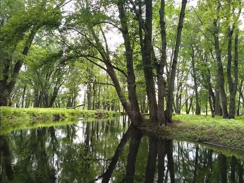
I accept a limited number of commissions each year, allowing every project the time and attention it deserves.
Each begins with observation and listening—to the land, the architecture, and the people behind the story. From there, the work finds its own direction.
ABOUT THE APPROACH »
Passing on a way of seeing.
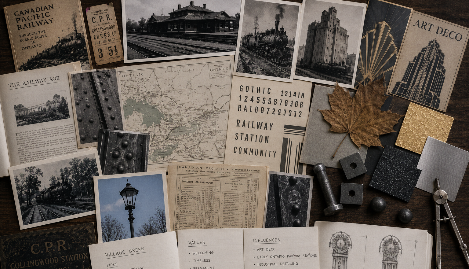
One-to-one mentoring for designers, signmakers, artists, and creative professionals.
After more than thirty years of designing identities, carving architectural work, and observing how places speak, I've come to believe that good design begins long before the sketch.
It begins with learning how to see.
My mentoring is a series of one-to-one conversations exploring observation, visual thinking, storytelling, and the confidence to create work that feels inevitable rather than imposed.
My hope is not simply to improve your work, but to change the way you see.
Learn About Mentoring »
Begin a Conversation
Every meaningful piece begins with listening.
Whether you're considering a place identity, a commissioned work, or simply exploring an idea, I'd be pleased to hear about the place, the people, and what has brought you here.