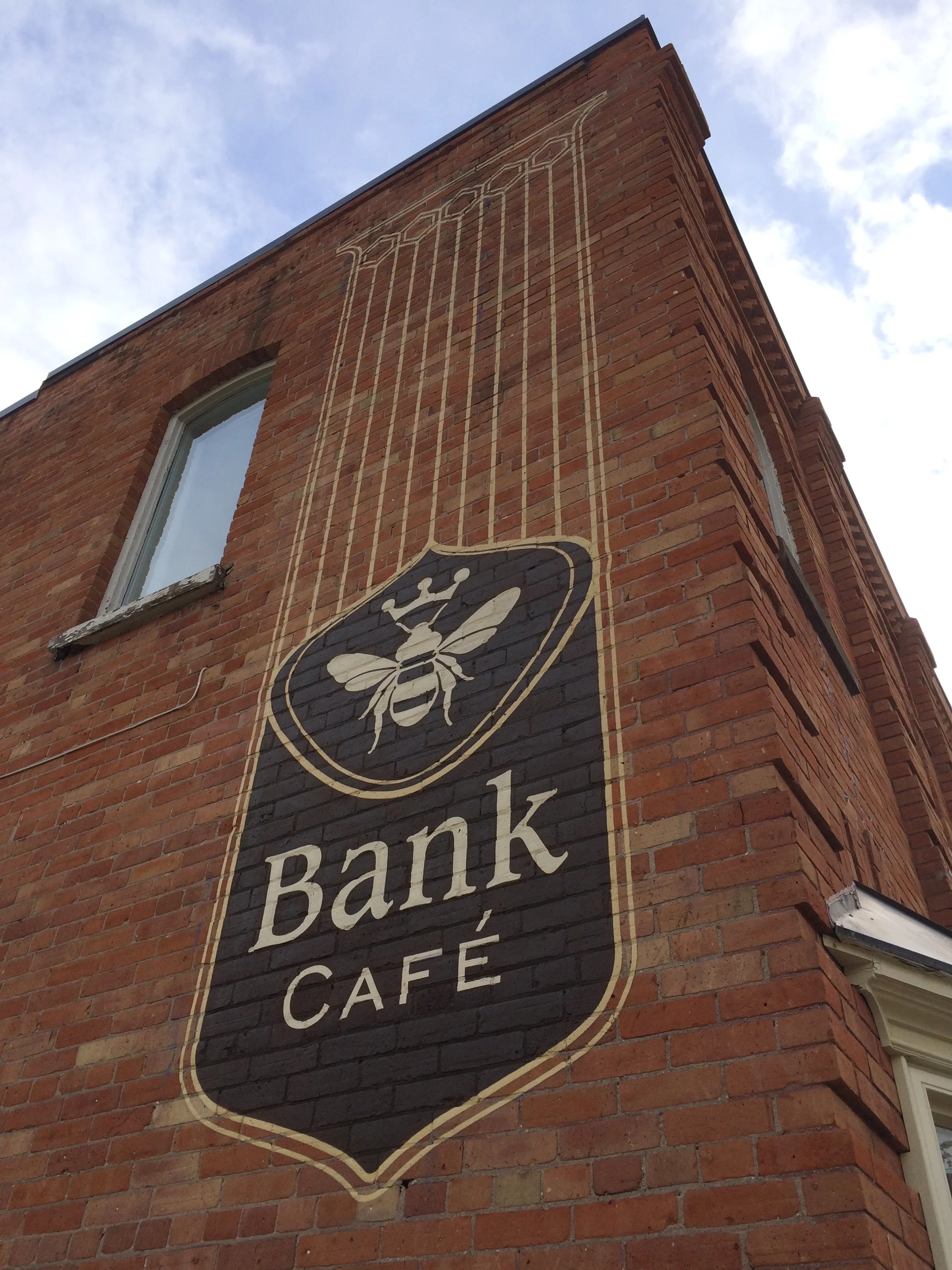
Hand-painted and rooted in heritage, the signage feels as though it has always belonged — giving the café a quiet permanence and a sense of place

Hand carved, lettered and crafted from HDU with 24Kt gold leaf.

An ad and POP card celebrating the wholesome, traditional goodness of their pudding, designed to harmonize with the café’s charm and Creemore’s authentic character.

visual brand created for their Friday burger nights.

Interior - sophisticated and rustic to reflect the historic quality of the village and surrounding rural landscape.
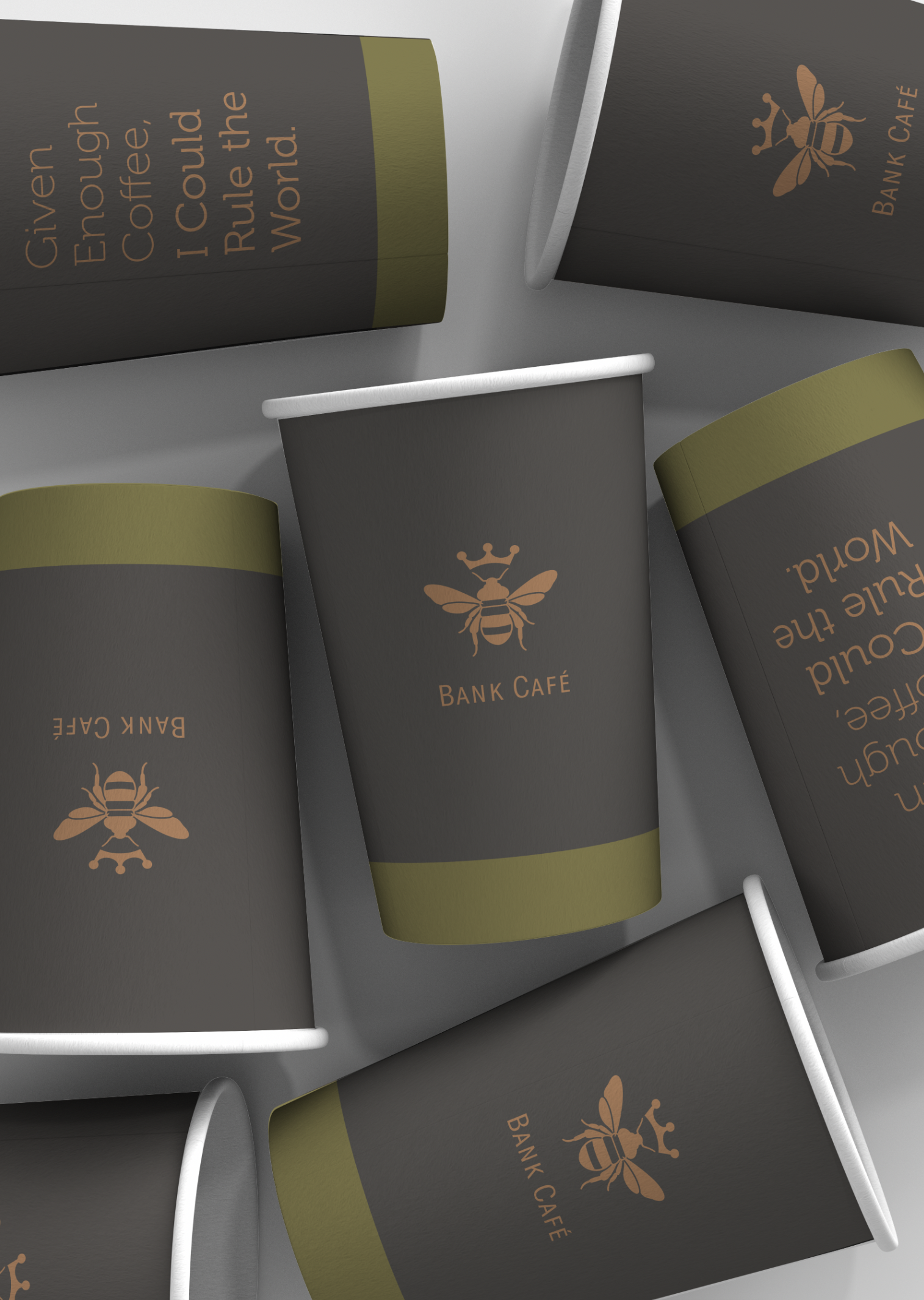
Coffee cup design capturing the delicious quality of their premium coffees. Each size had different colour banding and coffee quote.
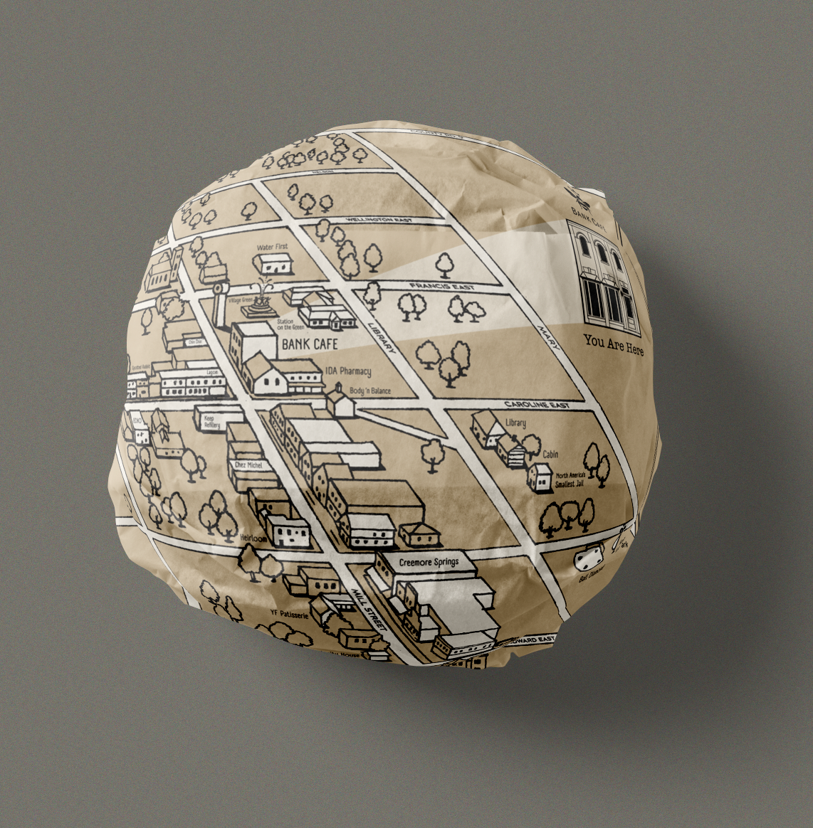
Food wrapper with a hand drawn map of Creemore with highlighted business and points of interest.
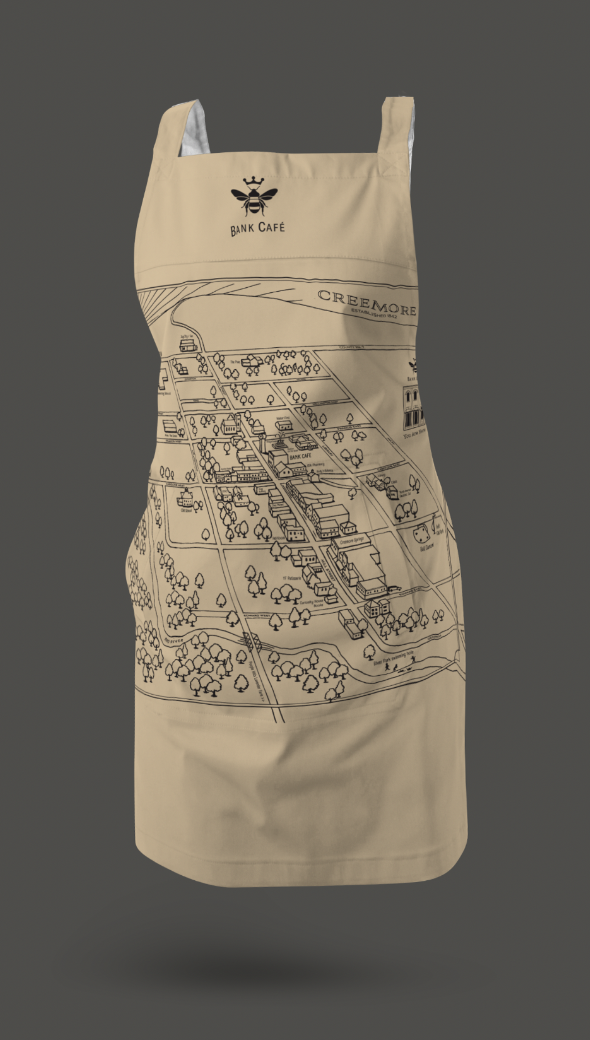
Branded merch with the hand crafted map of Creemore.

Bank Café
Creemore, Ontario
The Bank Café’s sign, logo, and visual branding are rooted in Creemore’s founding era, framed by the ideals of nation-building that shaped the village. The design has a classic, timeless quality, reflecting an archetypal form from another time — a visual language that emerges from history rather than being imposed, giving the café an authentic, established presence that feels as if it has always belonged.