
Mad River Mill Co.
A place that feels as though it has always been there.
Distilled from
Heritage • Vernacular • Landscape
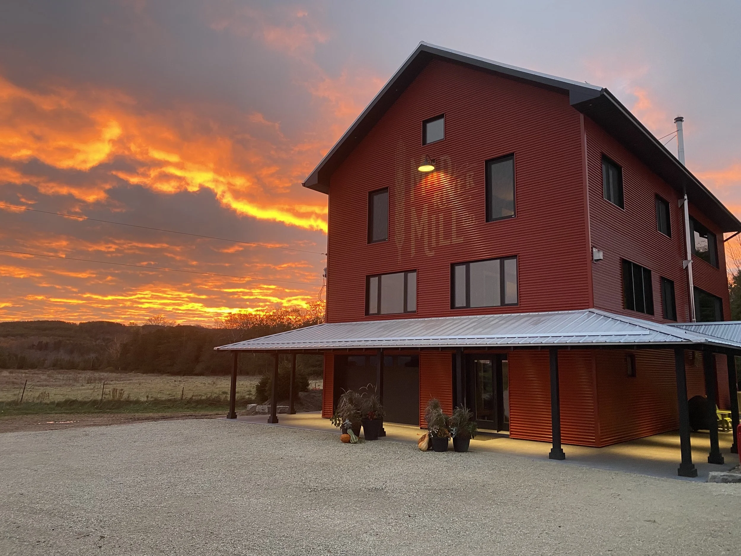
The identity for Mad River Mill was created for a newly renovated rural home in Glen Huron. Although the name itself is fictional, it was conceived as though it had grown naturally from the history of the place.
Rather than announcing itself as a new addition, every decision was made to reinforce the building's quiet relationship with the surrounding landscape and the agricultural heritage of the region. The result is an identity that feels less like branding and more like a natural extension of the architecture itself.
The Brief
The home had been thoughtfully renovated using the local farm vernacular, creating a building that felt rooted in the countryside rather than recently constructed.
The identity needed to support that same intention—not by recreating history, but by extending it. The goal was to create the impression that both the name and the lettering had always belonged to the building.
Reading the Place
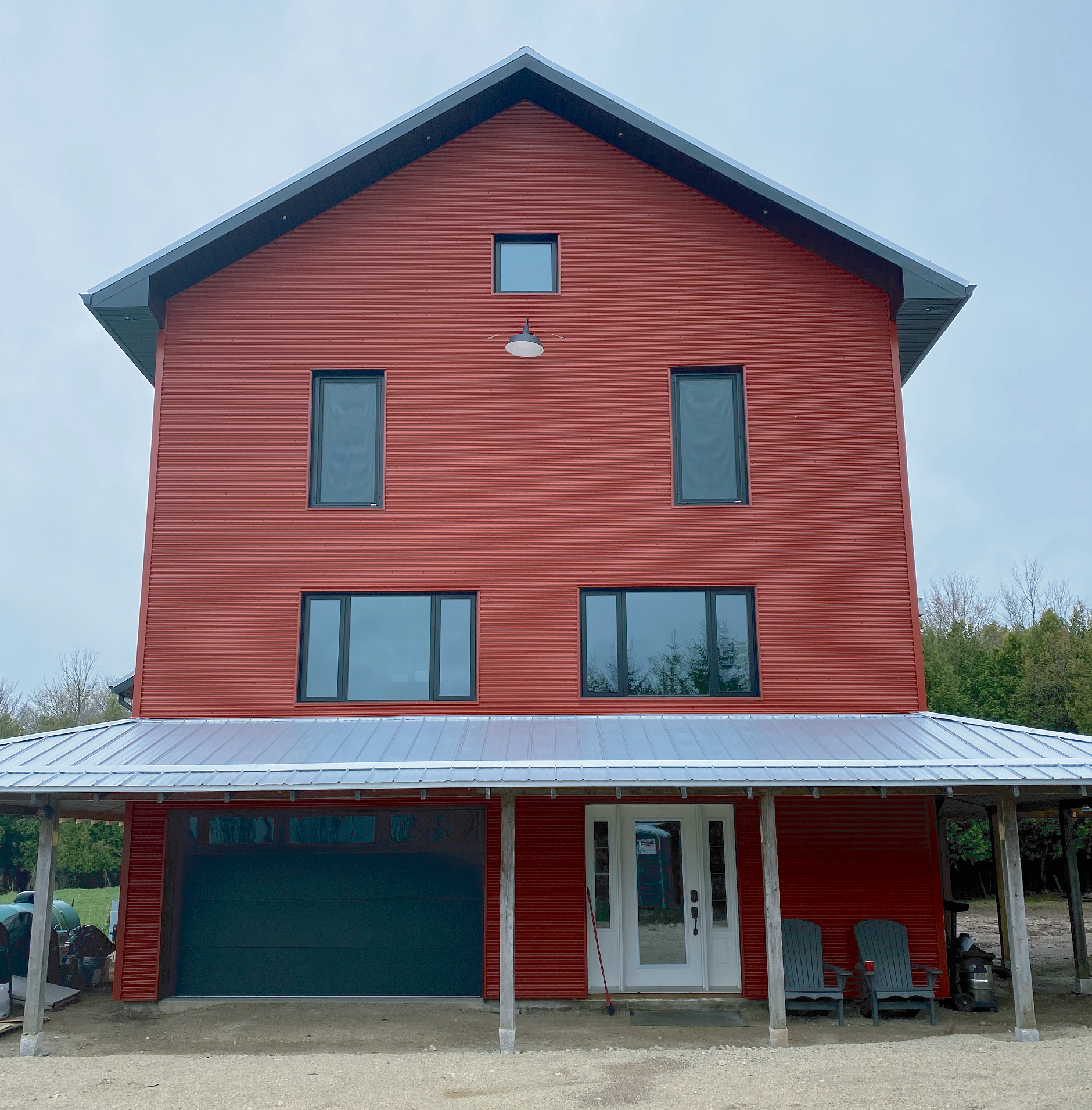
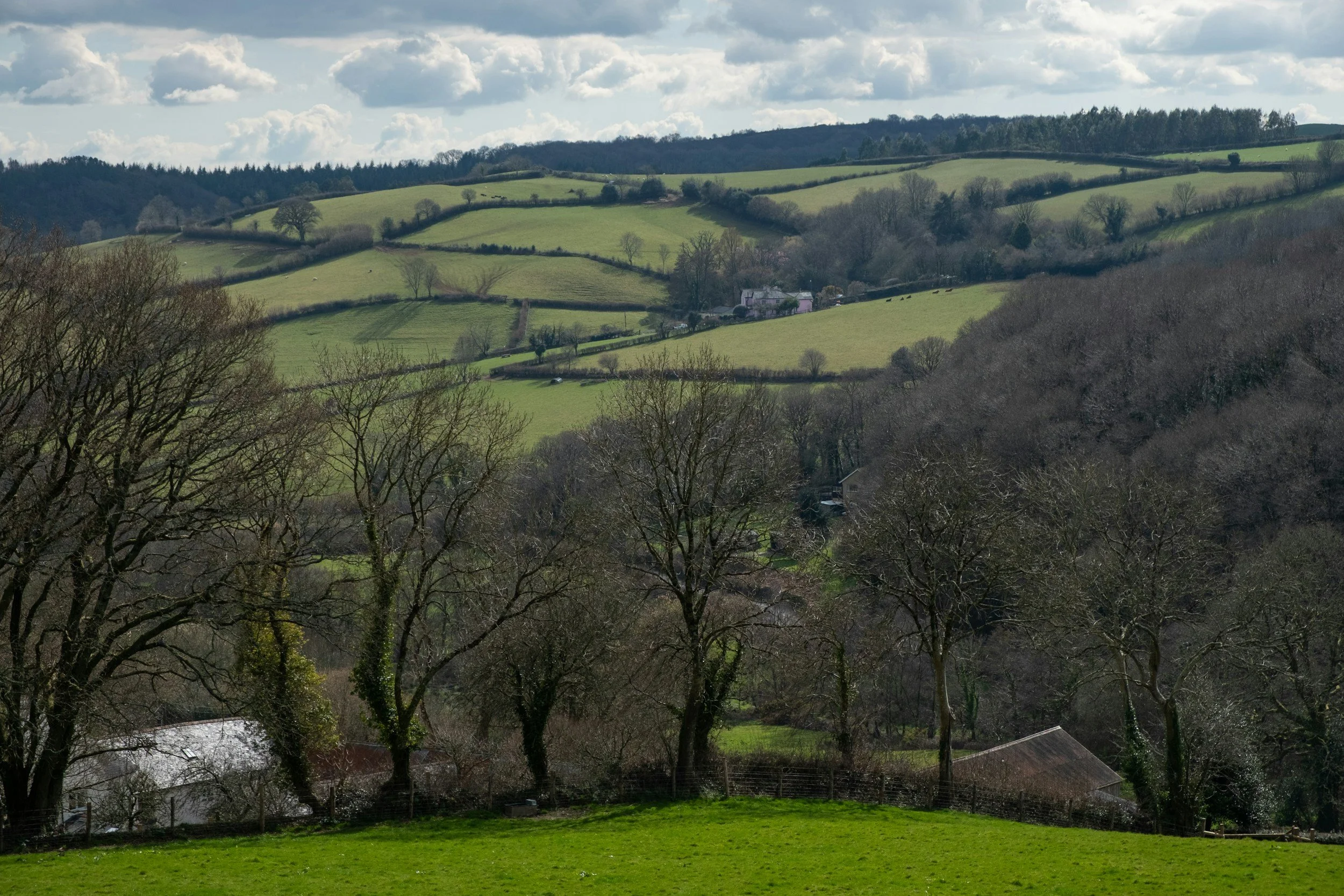
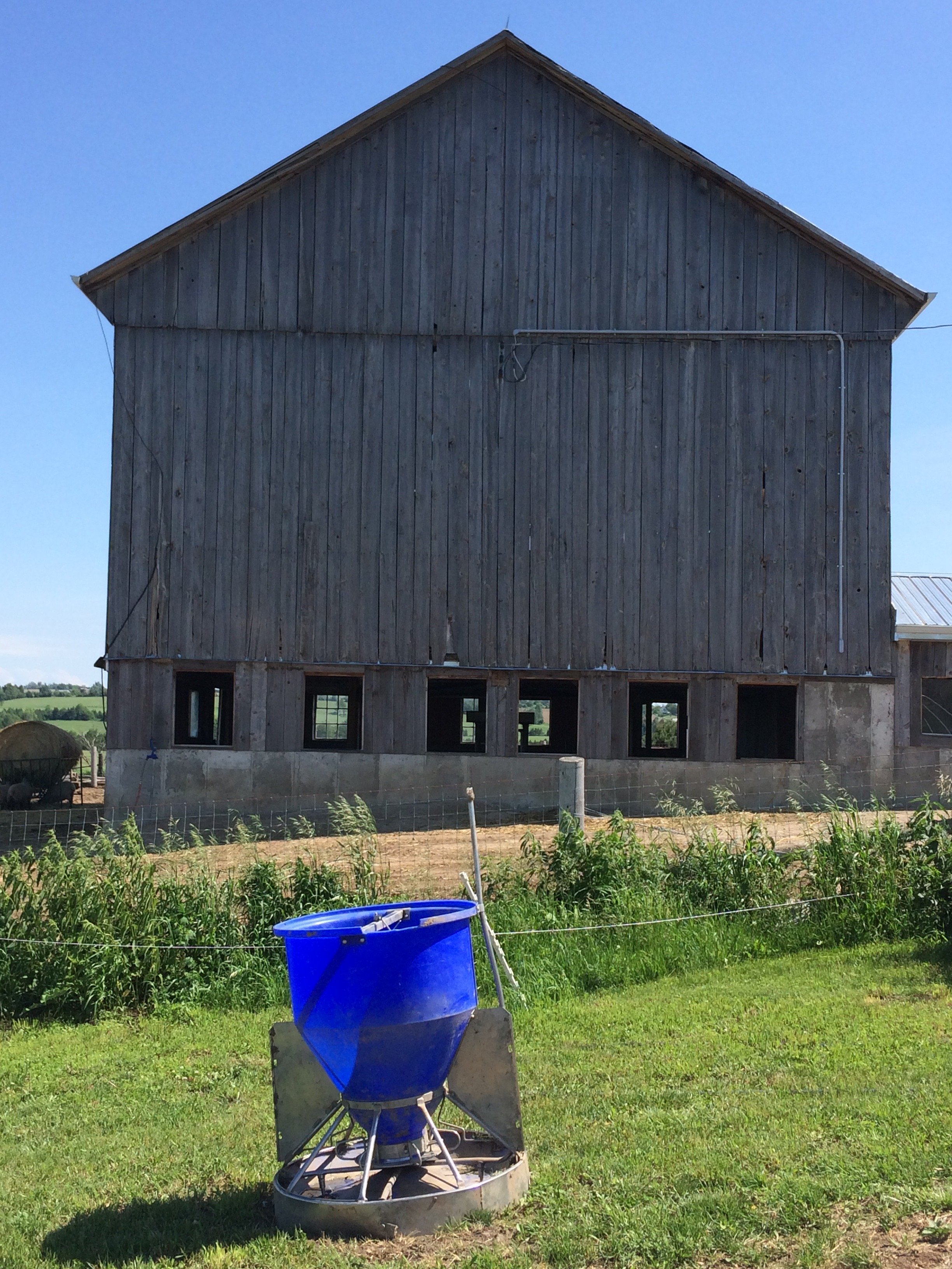
The rural landscape around Glen Huron is shaped by generations of simple agricultural buildings. Their strength lies not in ornament but in proportion, honest materials, and quiet utility.
The renovated home embraced those same qualities, drawing from the forms and colours of traditional Ontario farm architecture. Rather than introducing a contemporary graphic treatment, the identity looked to the understated painted lettering often found on historic barns, mills, and rural workshops.
The project began by observing what was already present and asking how the identity could become part of that story.
The Distillation
The name Mad River Mill was created as a quiet nod to the region's history rather than a literal description of the building. It lends the home a sense of continuity, suggesting a history that feels entirely plausible within its setting.
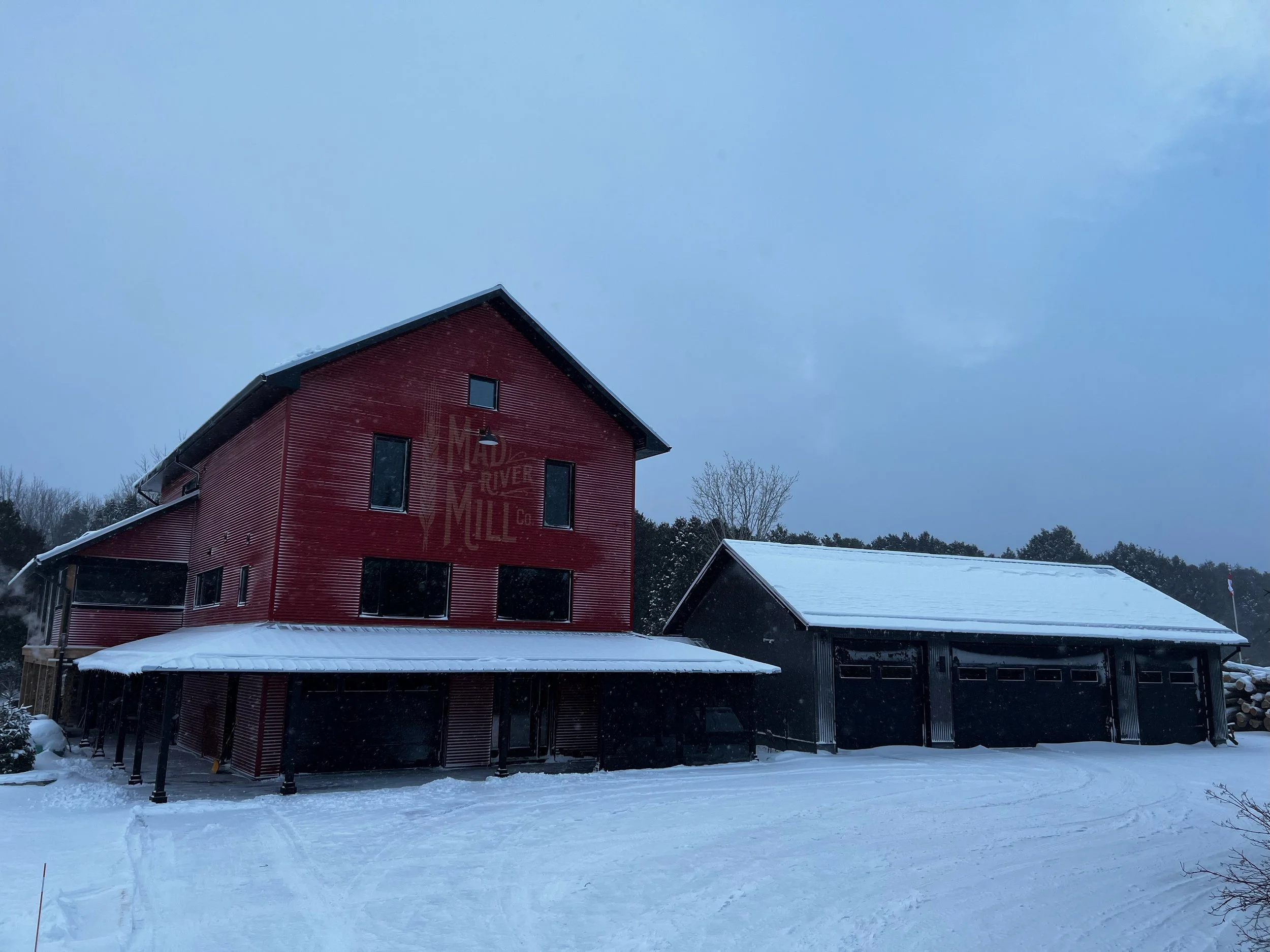
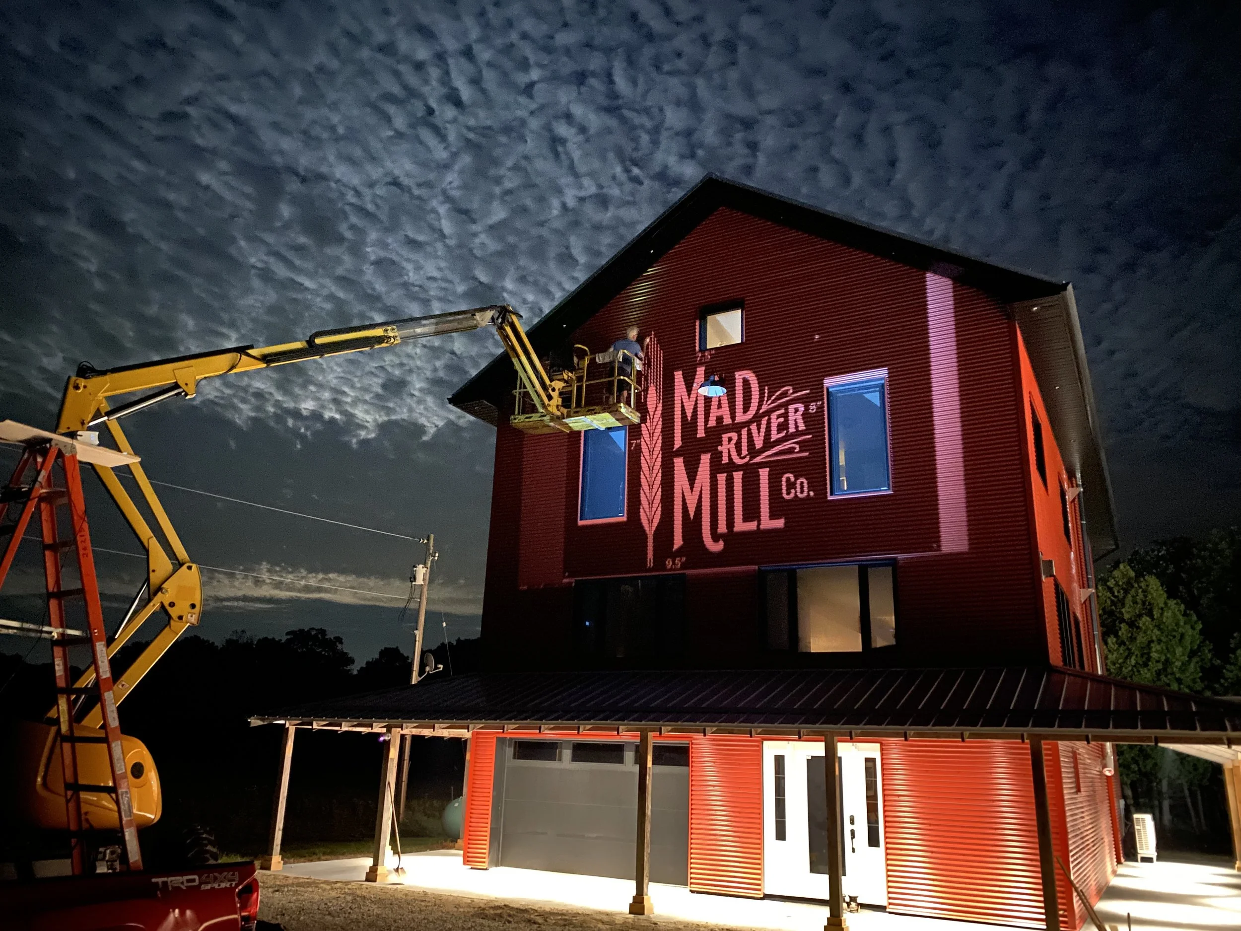
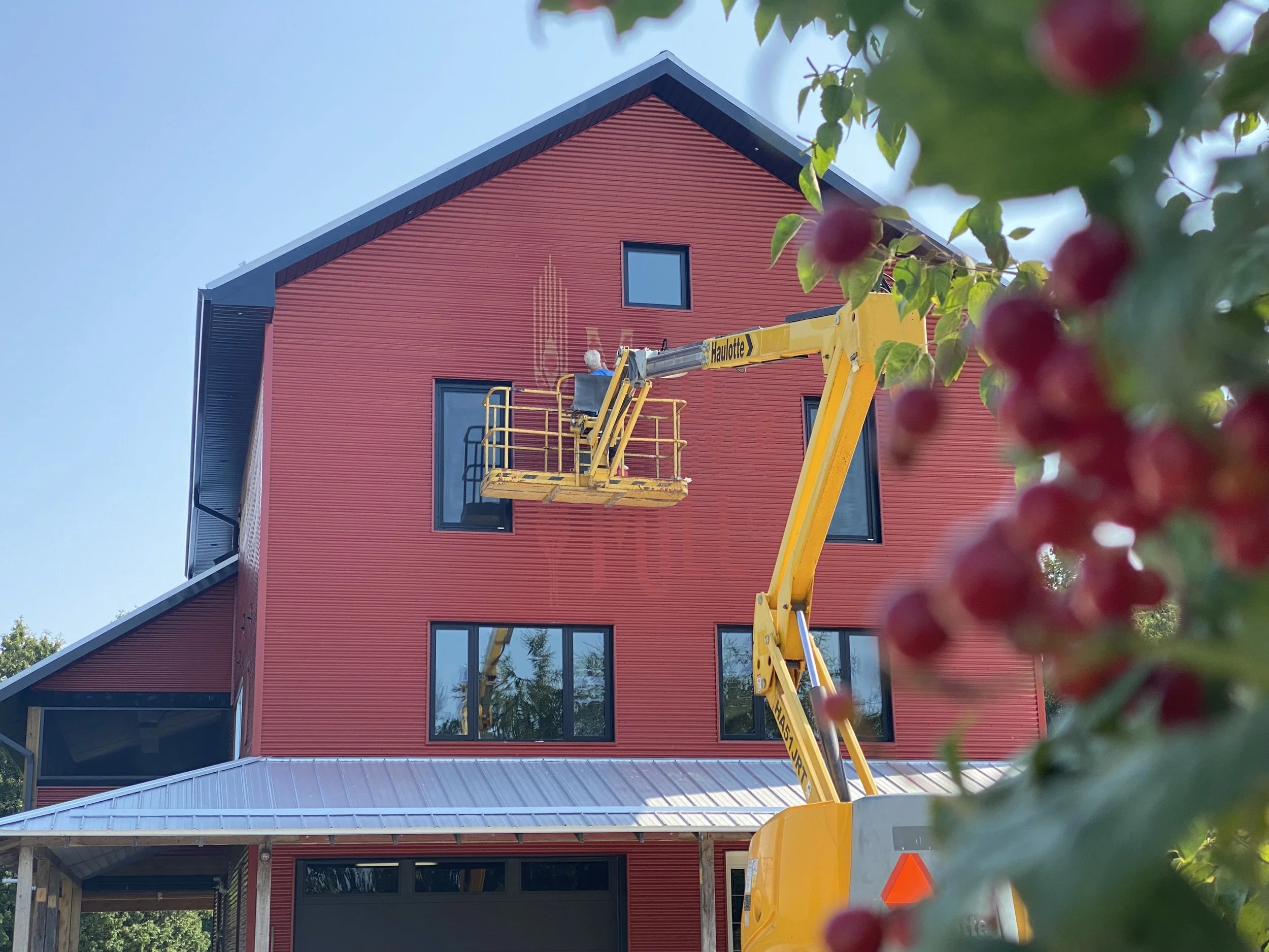
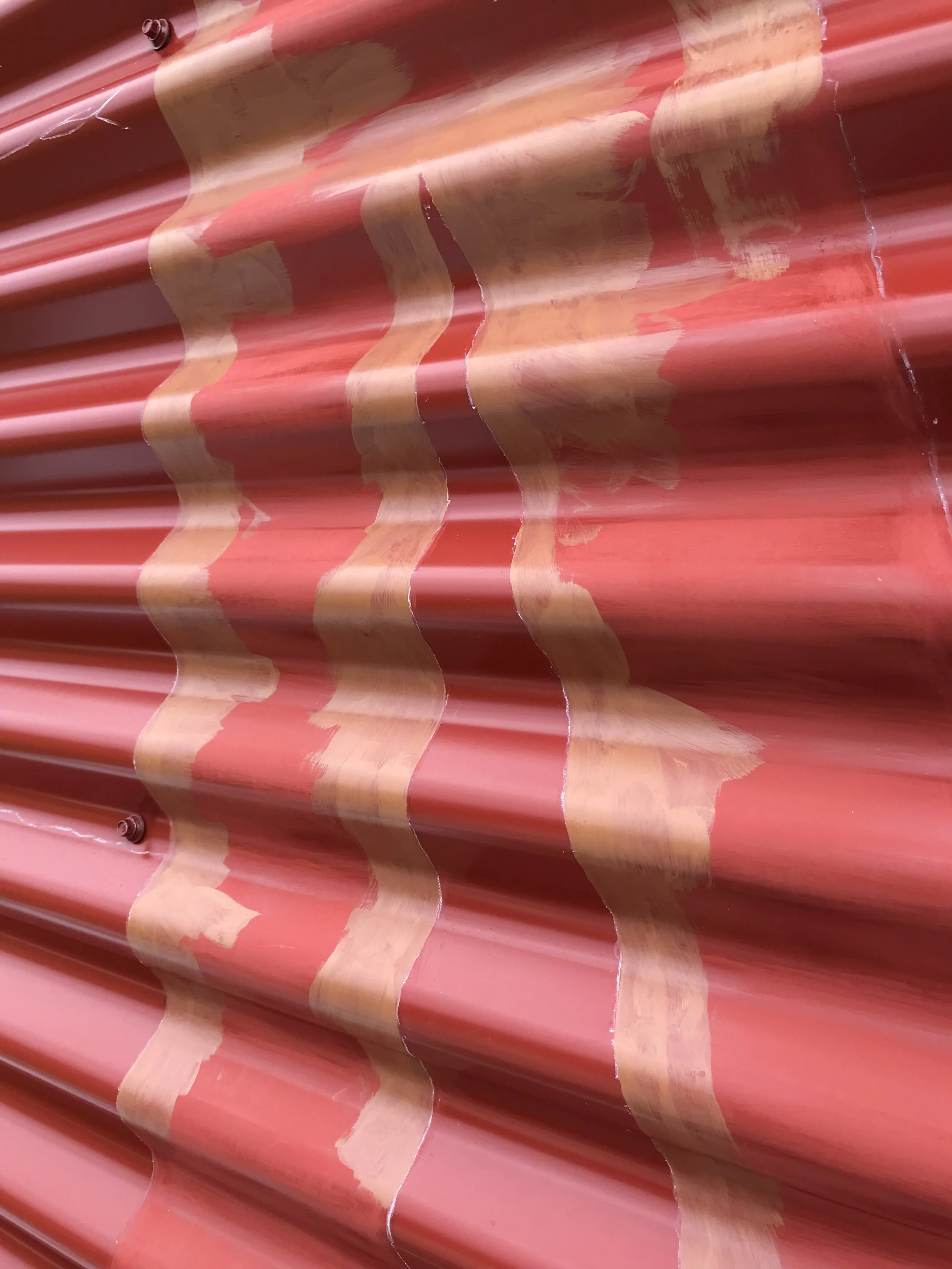
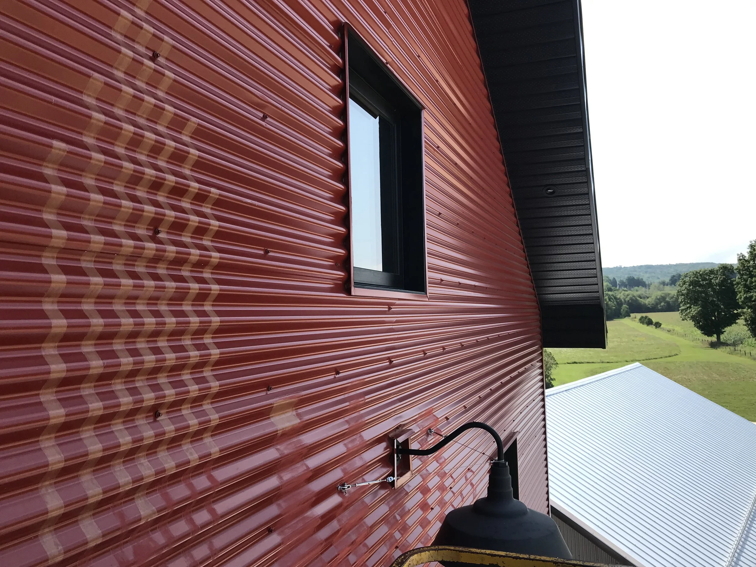
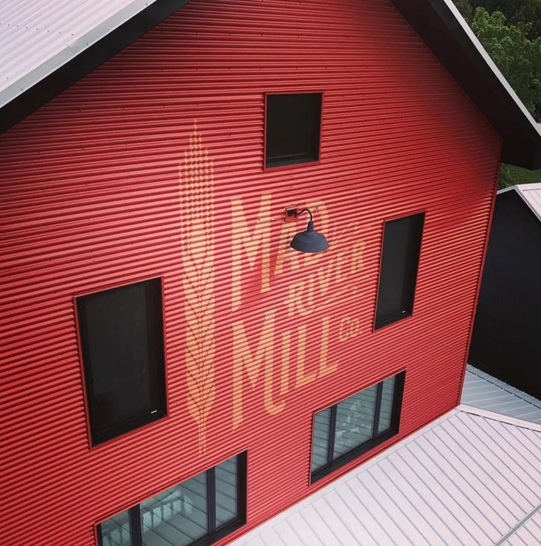
The lettering was hand painted using a custom colour made by blending fifty percent of the building's barn red into the lettering paint. Instead of creating contrast, the colour allows the words to settle into the surface, becoming part of the architecture rather than sitting upon it.
The lettering is meant to be discovered rather than announced.
Like the building itself, it feels less designed than simply present.
Expression
Every aspect of the identity was guided by restraint. The hand-lettered forms, muted colour, and careful placement work together to support the architecture without competing for attention.
Rather than becoming the focal point, the identity quietly reinforces the character of the building and its relationship to the surrounding landscape.
The Result
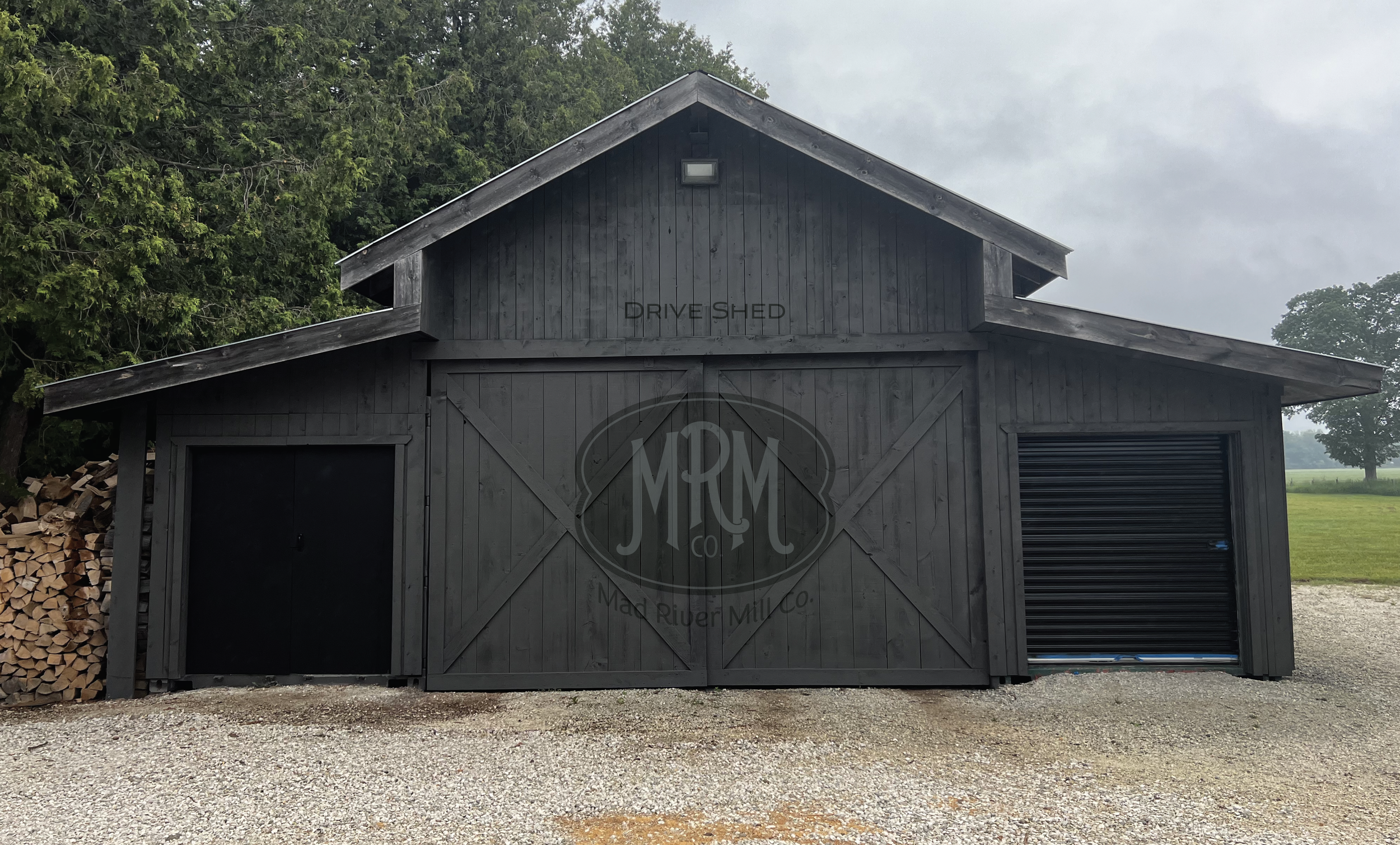
The finished work completes the illusion of permanence.
Although both the building and its name are contemporary, together they possess the quiet confidence of something shaped by time. The identity honours the local heritage without imitating it, allowing architecture, landscape, and memory to feel seamlessly connected.