A new business woven into the story of a historic village.
Bank Café
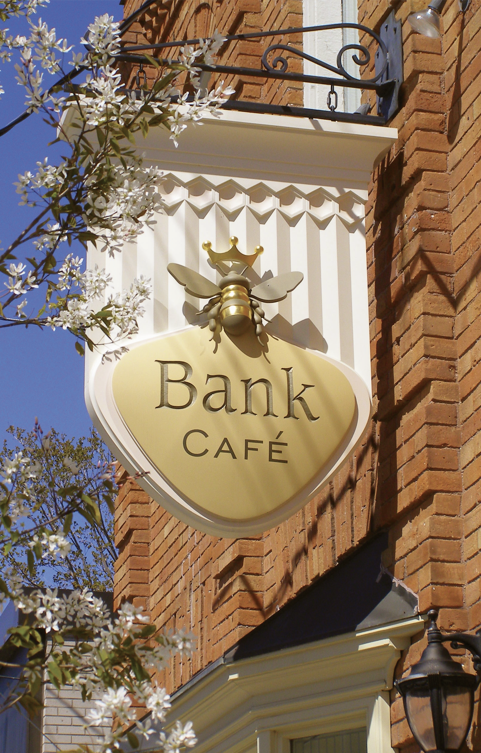
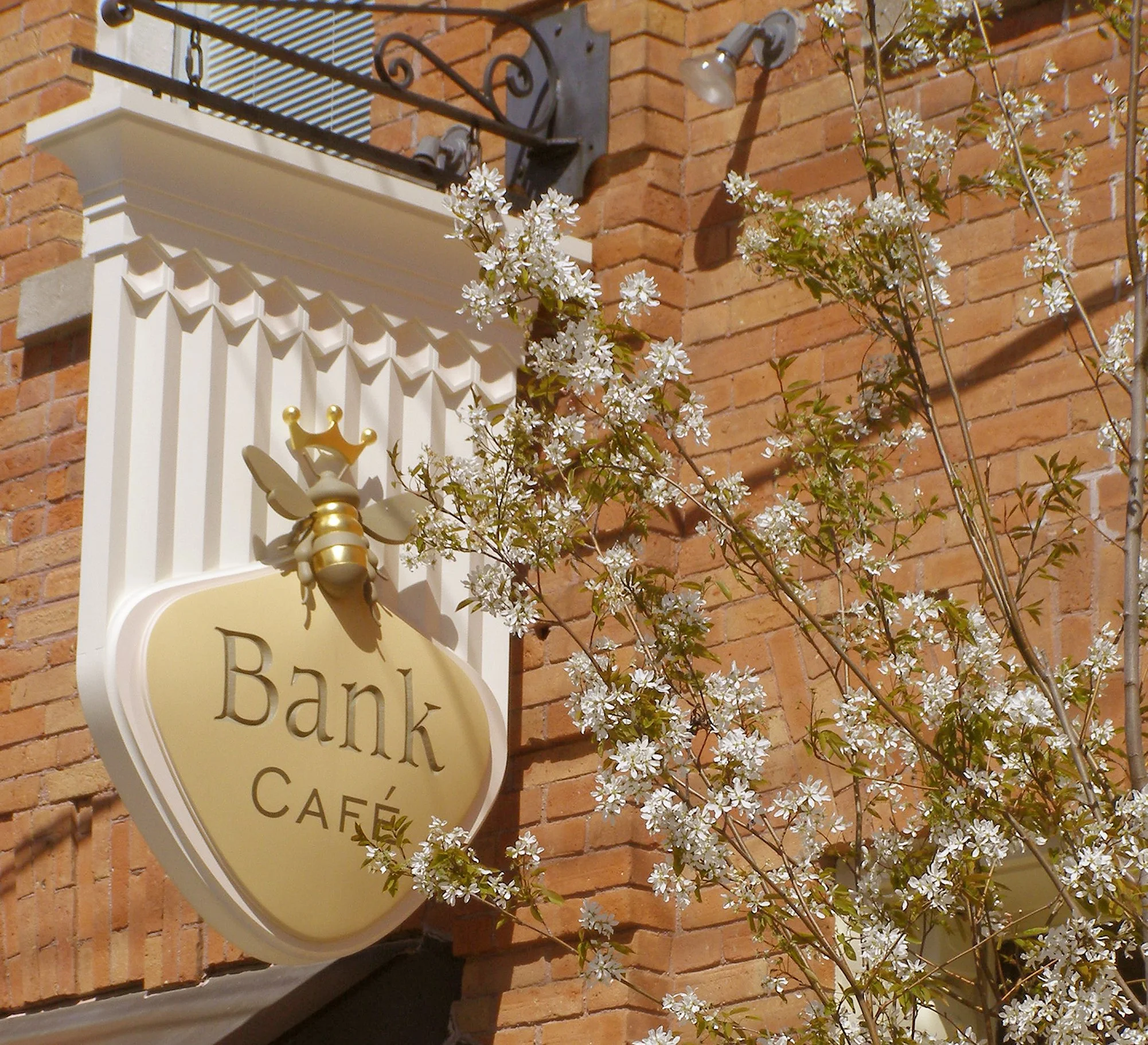
The Bank Café's sign, logo, and visual identity are rooted in Creemore's founding era and the enduring character of the village. Rather than introducing a contemporary visual language, the identity draws from the building's architecture, the history of the community, and the surrounding rural landscape to create something that feels quietly familiar.
Each element was distilled from the relationship between the business, the building, the village, and the landscape. The result is an identity that feels less designed than discovered—a natural expression of place.
Distilled from
Business • Architecture • Village
The Brief
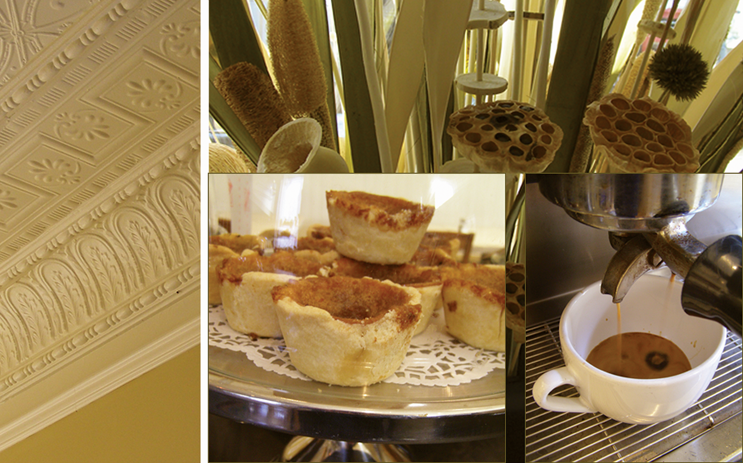
The owners wanted more than a café. They wanted a welcoming gathering place where people could enjoy simple, thoughtfully prepared food within a setting that felt established from the day it opened.
That intention became the foundation for every design decision.
Reading the Place
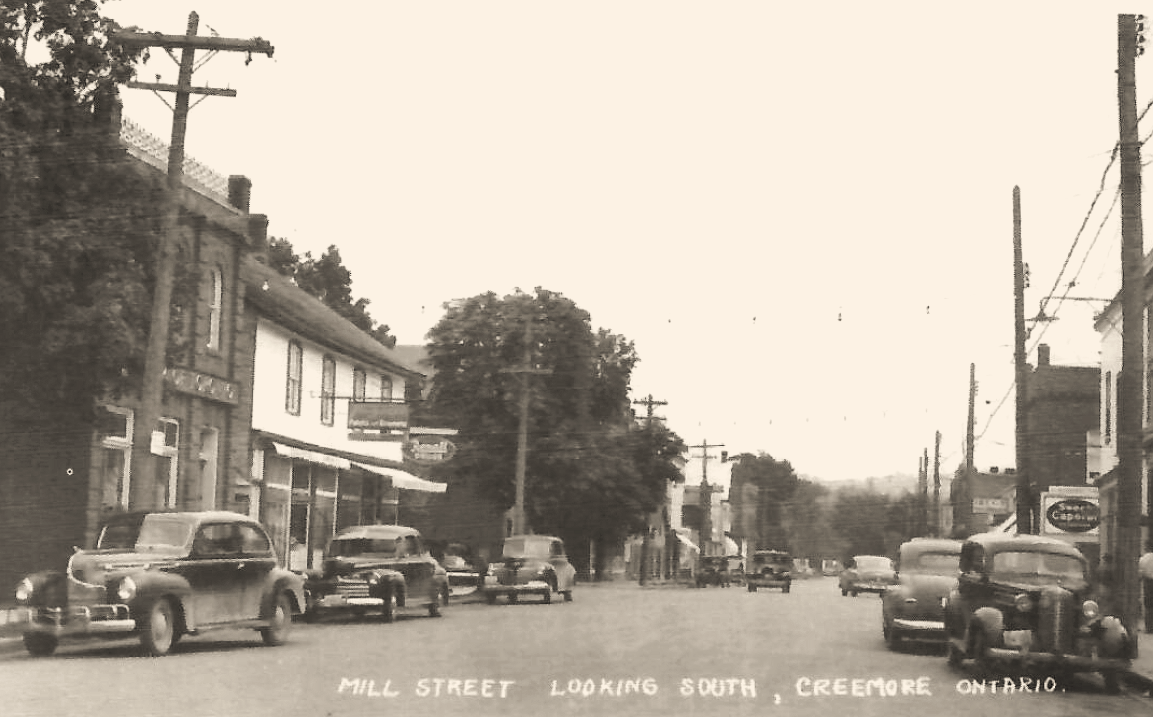
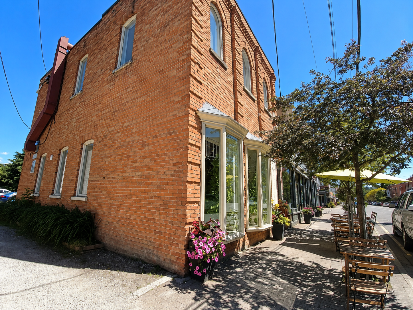
Originally built as a bank in the late nineteenth century, the building carries a quiet dignity. Its red clay brick, balanced proportions, and restrained architecture provided the visual language for the identity.
Creemore became the second influence. The village has retained a character that continues to draw people from well beyond its borders. Its history, architecture, surrounding farmland, and strong sense of community create an authenticity that cannot be manufactured.
The identity was developed by listening to both.
Distillation
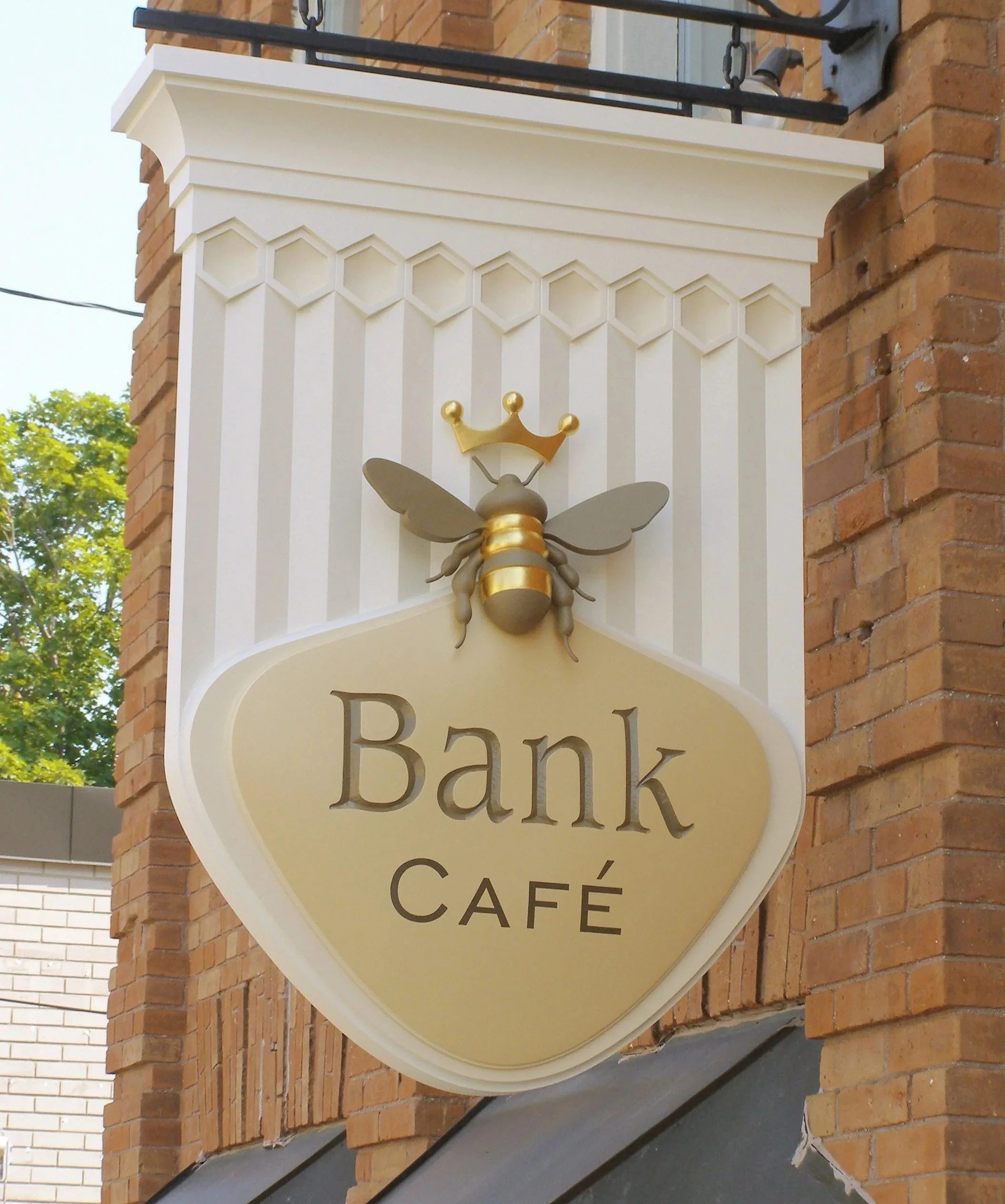
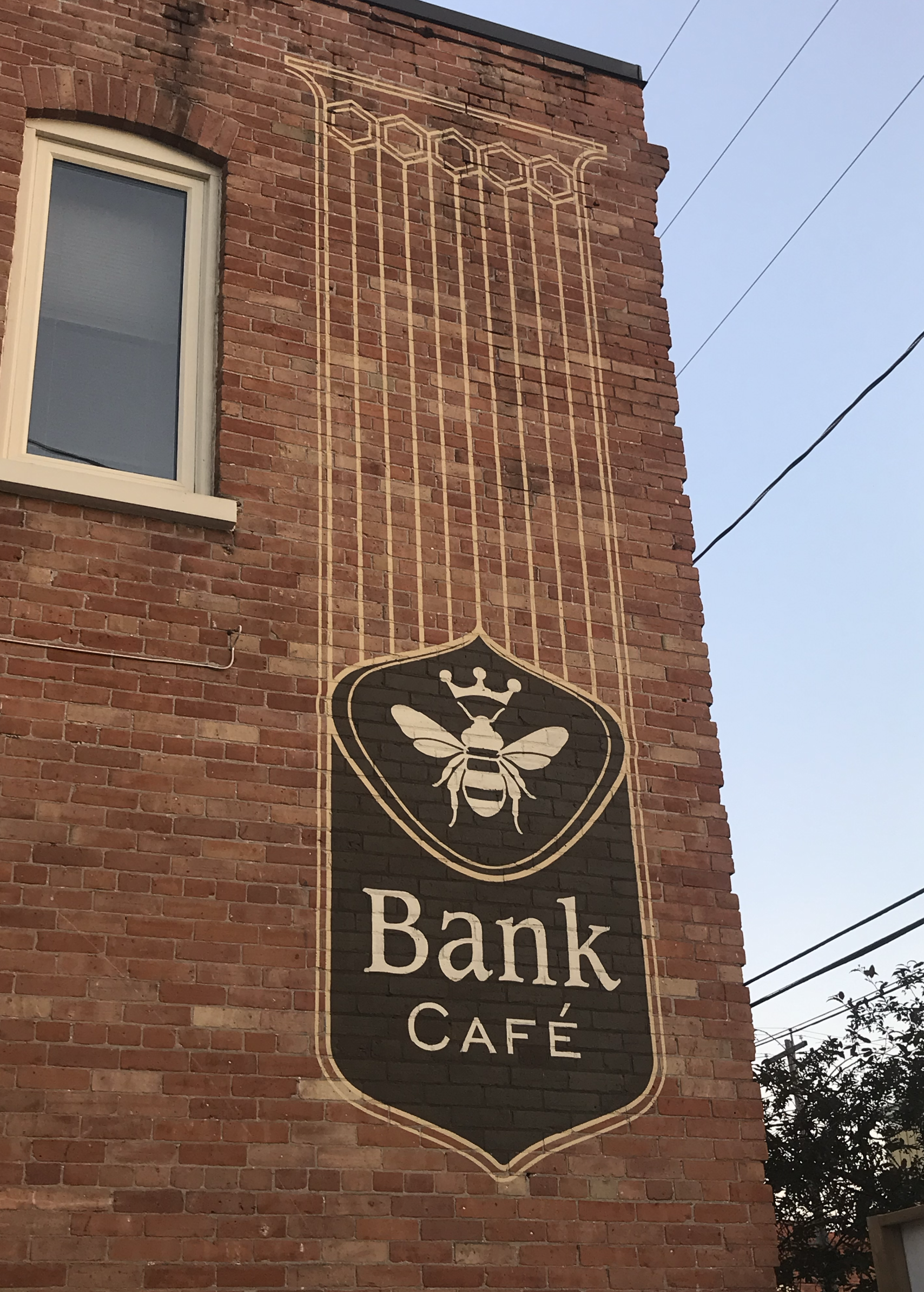
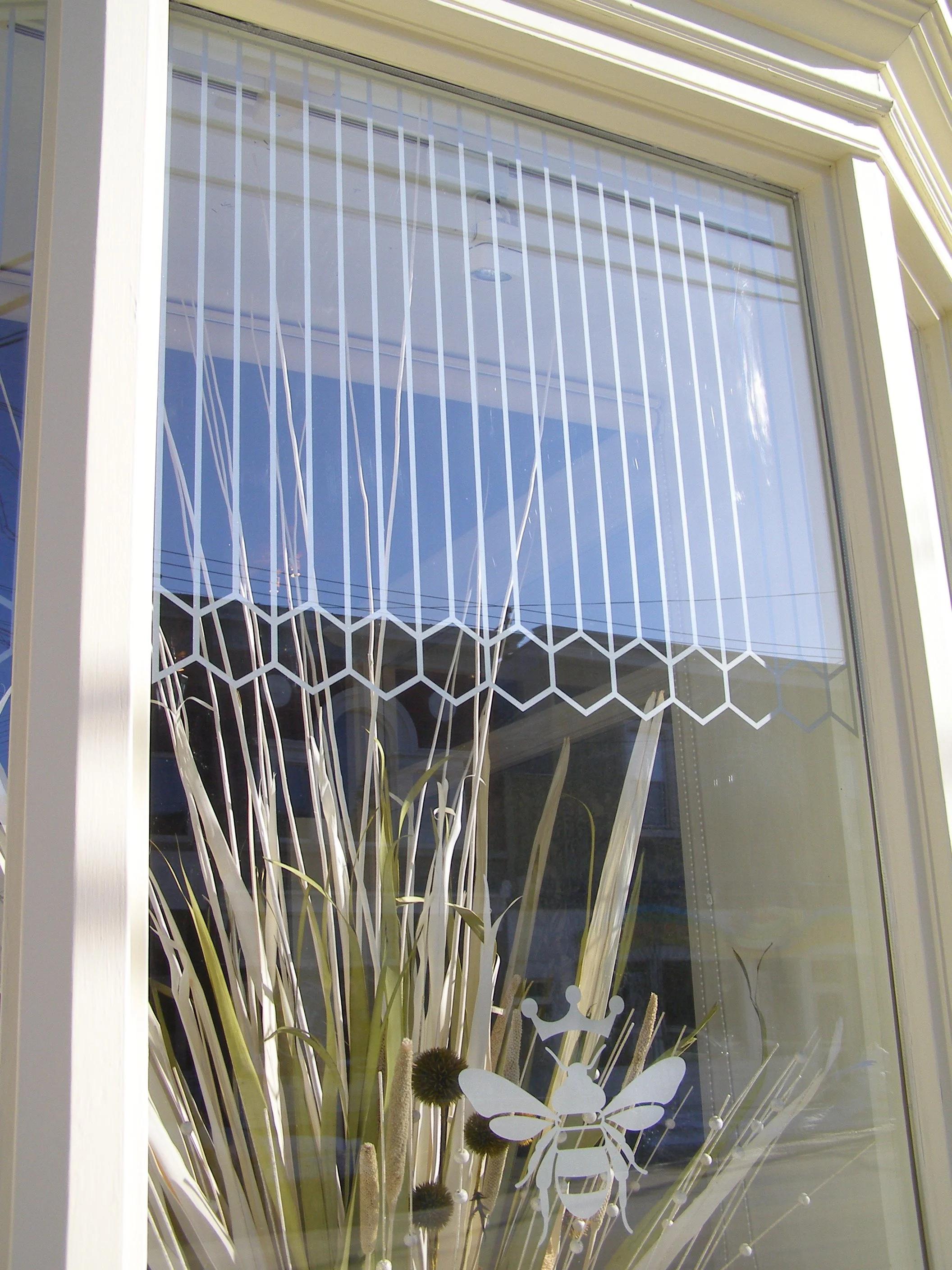
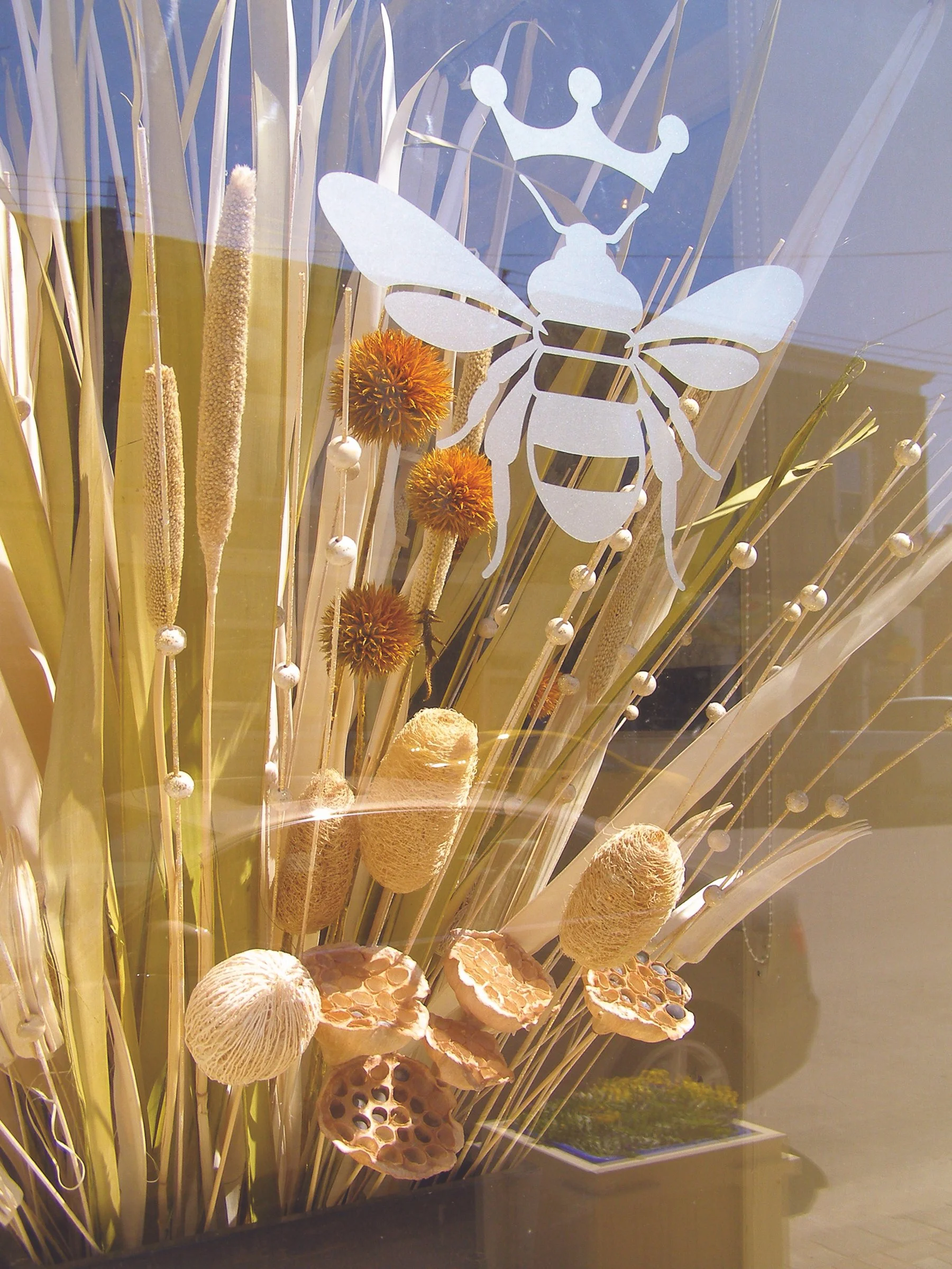
The bee was chosen because it connects the café's role as a gathering place with the early beehives that supported the orchards and gardens of the founding community.
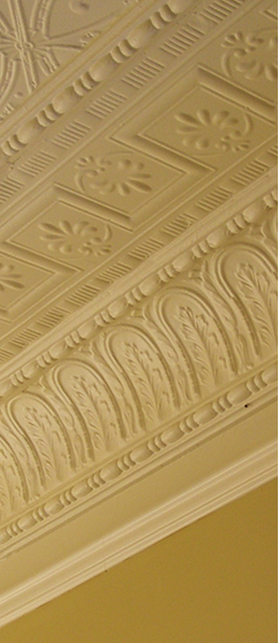
The form of the sign was inspired by the gentle flow of honey. Its proportions echo the building's architecture, while its visual weight reflects the quiet dignity of the original bank. The colours were drawn from the brick, limestone, and surrounding landscape.
Each decision contributes to a single idea rather than calling attention to itself.

The Result
The finished identity doesn't tell one story.
It brings together the character of the business, the building, the village, and the surrounding landscape into a single, coherent expression of place.
It feels less like something that was designed and more like something that simply belongs.